You are using an out of date browser. It may not display this or other websites correctly.
You should upgrade or use an alternative browser.
You should upgrade or use an alternative browser.
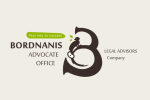
Logo Advocate Office
- Thread starter paku
- Start date
Again, no idea which part you're referring to - the whole thing, the 'B/3' shape, the text beside it?
Without context of the brief and the client and what they wanted, it's hard to critique.
You've shown something here that's impossible to critique or give feedback on because logos are driven by clients desires, none of which you've presented here.
Asking to rate it, we can only rate it on our own perception of what we think is good or bad.
I might say it's 1 out of 10, someone else might really like it and score it 9/10
But that's personal taste, and not related to judging a logo based on what problem it was supposed to solve.
If we had context then I might be able to say that you solved the clients problem perfectly, you executed what they wanted and solved their issue and I can then increase my rating to 8/10 or something.
But people in the business don't usually rate things out of 10 when it goes up to 11.
Anyway - getting off track here....
You need to provide context.
We don't score each others work - we discuss it openly and talk through the decision making process and directsion we might have taken to improve.
Logo creation is problem solving and execution.
Rating things out of 10 is just not a useful exercise and gives you no feedback other than personal like or dislike.
graphicdesignpiccolo
New Member
It's 6 for me because its seems a boring design that's how I feel when look on the logo.
New Perspective Studio
New Member
The best way to get an answer to this is to the target market think about this. This I after all who you are designing this for and who it needs to impress. I think this forum is filled with graphic designers so you get a graphic designer's opinion which may not be what your target market thinks. I believe @hankscorpio did a good job of explaining this in detail.
So my critique as a graphic designer:
2 - 4 of 10
At quick glance, I don't know what this company does.
Your typography is all over the show to the left to the right of different sizes. ( the advocate office and legal advisors company all need to be in the same place preferably by the name. )
I don't think this logo will scale well.
Looks very "playful" not what id go for with an advocate office (this could change depending on the target market)
Again just my personal opinion but less is more I can actually see this being an ok logo because the b3 bird thing is quite unique but it all just doesn't tie in together right now.
