

DaisyGirlDesigns
Junior Member
I was approached by members of a local company who knew of my design work, and they wanted me to re-brand their old company. As it turns out, the two that approached me have left the old company to set up a rival company as members of their business partnership did not see the reason to use a targeted design approach (they are happy with farmers market style packaging!), and the people i am working with want to target their product more. They have done a lot of market research over the years, and want to target families and teenagers. I am limited to four colours, and these are the basic things that have been developed over the last month:
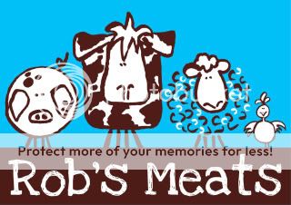
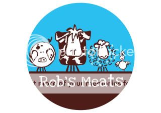
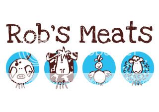
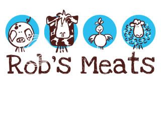
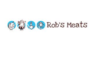
The characters were all hand drawn then scanned in and traced in illustrator. The reason behind the chosen colours is that i wanted to use a vibrant, fresh, attractive colour, like the blue, but on its own this would make the food products look a bit radioactive... if you get my drift, so i feel it is earthed well with the brown...i think...
Basicly the company values are earthy, hand made, family values, friendly, affordable... It needs to stand apart from other value meat products. Quality to look out but cheap and affordable!
Any help would be appreciated as i am also submiting this as part of my uni work