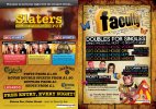
Just thought I'd post some work up on here. It's for an owner of a bar am currently working with and they want to do a big student freshers campaign. you'll notice the front and back of the flyer is to different bars. The owner owns both and the venues are next door to each other so they believe it to be cost effective.
Any how, have a nose and any feedback please feel free to comment.
PLEASE NOTE: just noticed the middle picture on slaters needs changing. this has been changed.

Any how, have a nose and any feedback please feel free to comment.
PLEASE NOTE: just noticed the middle picture on slaters needs changing. this has been changed.
