You are using an out of date browser. It may not display this or other websites correctly.
You should upgrade or use an alternative browser.
You should upgrade or use an alternative browser.
Kerning Advice
- Thread starter Create
- Start date
Paul Murray
Ultimate Member
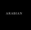
The spacing looks quite consistent across the top. The AN could maybe be brought in towards the I a bit but I don't know if I'm just being fussy.
Coffee_and_Toast
New Member
CLHB is right, the first three characters look slightly loose and the 'I' is tight on the 'B', I'm not sure tweaking the kerning will totally fix it though.
Not sure the typeface is suited to being displayed full-caps like this, is it imperative you use this typeface? Or does it have small-caps you could try for the 'RABIAN' part? The 'ARA' in particular doesn't look comfortable all in upper-case because of the valley of negative space created by the two 'A's.
Not sure the typeface is suited to being displayed full-caps like this, is it imperative you use this typeface? Or does it have small-caps you could try for the 'RABIAN' part? The 'ARA' in particular doesn't look comfortable all in upper-case because of the valley of negative space created by the two 'A's.
