You are using an out of date browser. It may not display this or other websites correctly.
You should upgrade or use an alternative browser.
You should upgrade or use an alternative browser.
Is this too bad for minimalism
- Thread starter Yohn
- Start date


Levi
Ultimate Member
One of the primary aspects of minimalist design is making things as simple as possible while still being understandable and legible. Yours fails at that because the background colour, the other shade of grey and black blends with it so you lose the incredibly fine text in the background.
Your visual hierachy is a being screwed by the different fonts as well, THE and DATE are different weights for example.
In some respects your friend is right, it is too simple, for someone that clearly isn't from where this is being done I have no idea where The Great Hall is soyou might need to expand on location a little more as I'm pretty sure there's a LOT of places called the great hall.
Ticket: 2K... that means absolutely nothing to me, I'm in the UK so I'm guessing it's 2,000 or maybe the K is krone
There's no contact information either.....unless it's all on the back.
Just as a side note, when I view that flyer in all honesty it feels more art deco than minimalist to me, not sure why though, it could be down to the choice of dark grey for the background as I've always seen minimalism more along the white end of the colour spectrum.
Levi
Ultimate Member
Minimalist design is not easy when you need to supply information. To be honest, it's not an easy design philosophy to get 'right' full stop.Thanks, so I guess I'll have to work on the whole design again
Basically start by working out what you would expect on a flyer, then reduce it down to the essentials. When you've done that you can then look at the actual layout.
Also remember minimalism doesn't mean it's void of character or being simple in it's design, it's more about (imo) layout, structure, hierarchy etc having their design principles refined down to their purest forms and presented in a way that makes them the focus of the design as much as, if not more, than everything else around them.
Researching it online isn't easy either, a lot of things seem to have used 'minimalist' to describe templates etc but they're not actually minimalist so it really muddles the water when doing research.
Thanks for the advice, can you recommend any material that'll provide more knowledge on minimalist designMinimalist design is not easy when you need to supply information. To be honest, it's not an easy design philosophy to get 'right' full stop.
Basically start by working out what you would expect on a flyer, then reduce it down to the essentials. When you've done that you can then look at the actual layout.
Also remember minimalism doesn't mean it's void of character or being simple in it's design, it's more about (imo) layout, structure, hierarchy etc having their design principles refined down to their purest forms and presented in a way that makes them the focus of the design as much as, if not more, than everything else around them.
Researching it online isn't easy either, a lot of things seem to have used 'minimalist' to describe templates etc but they're not actually minimalist so it really muddles the water when doing research.
Levi
Ultimate Member
Other than a book that I have that is imo a good example of minimalist design (minimum by John Pawson), both content and the book design, I can't really think of anything off the top of my head I'm afraid.Thanks for the advice, can you recommend any material that'll provide more knowledge on minimalist design
Thanks alotOther than a book that I have that is imo a good example of minimalist design (minimum by John Pawson), both content and the book design, I can't really think of anything off the top of my head I'm afraid.
I personally would see this as white background with black rectangles behind the white wording and in reverse.
2k ( I don't know what it means )
Looking forward to an updated version!

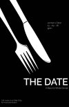
How'd this do?
Levi
Ultimate Member
Um... it doesn't say minimalist to me, however it is a much better design overall, maybe just needs to tweak the placement and choice of font to suit the knife and fork which are imo more art deco in styling.How'd this do?
If you decide to go down an art deco route (nothing wrong with art deco for a 'black tie' event imo), may I suggest reversing the colour scheme so the white is black and the black is white, I think it may work slightly better overall. Actually thinking about it (not easy to see full image as it's HUGE lol) you might want to try placement of the knife and fork, imo move it so it's coming from the top left corner and adjust text accordingly.
Last edited:
Still have a long way to goUm... it doesn't say minimalist to me, however it is a much better design overall, maybe just needs to tweak the choice of font to suit the knife and fork which are imo more art deco in styling.
Levi
Ultimate Member
I've done some edits to my original post.Still have a long way to go

Levi
Ultimate Member
I preferred the previous one, try what I said about inverting the colours. The choice of font on this one is more art deco though.Maybe a different direction? View attachment 6407
View attachment 6406
How'd this do?
I like it, but personally, I would draw a diagonal line, one part would be contrasted to the other part. same with the words and knife + fork.
Thanks, I'll get to itI preferred the previous one, try what I said about inverting the colours. The choice of font on this one is more art deco though.
Can you please expatiate on this, I kinda don't understandI like it, but personally, I would draw a diagonal line, one part would be contrasted to the other part. same with the words and knife + fork.
Like this?I preferred the previous one, try what I said about inverting the colours. The choice of font on this one is more art deco though.
Attachments
Levi
Ultimate Member
Along that sort of line, you might need to tweak it a little to get it right but that's basically the idea I was suggesting.Like this?
Also maybe try doing different ways of presenting the date and contact details, I think it would look better with 13th August 2018 versus 13-9-18 for example. Mind you it's the client you need to make happy more than me
