Kev Clarke
Member
Hi Guys,
I am currently in the middle of creating a new identity for a supplier of innovative natural stone, and i have attached my latest concept for critique. Heres a little bit about the company, the brief i was handed and my thinking.
The client has asked that a design be created that combines a corporate feel with a creative vibrancy and something that is different to others within the industry. They have also asked that the strong lines, vibrant colours and clear geometric shapes from the products are also reflected in the design.
The client also wants a letter form mark that is dynamic across different aspects of the brand, and that can work alone with out brand name as they look to the future with mobile apps in mind.
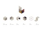
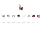
From research gathered i have found the company has a set of 3 core principles in place that are the foundations for each of the 6 facets/products it specializes in. This helped me with choosing the geometric shapes used in my design.
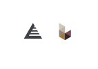
In terms of structural engineering the triangle is the strongest shape because it is the only flex cornered polygon that holds its shape, therefore it alone accounts for all structural shaping in the universe, and is the single most perfect geometric shape. 2 points that represent the product perfectly. Strong, durable and stylistically innovative.
A field of these modules, or cluster of triangles together forms a greater whole, telling a story of strength in numbers also creating a mosaic of diversity. This is symbolic of the vast range of natural stone products available to the customer.
With this in mind i have opted to create a series of logos that will all sit under a parent letter form mark of L for the comapny name.
Please let me know your thoughts,
Attachments
Last edited:


