Initial Logo Idea

theking79

Member
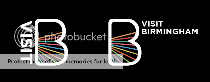
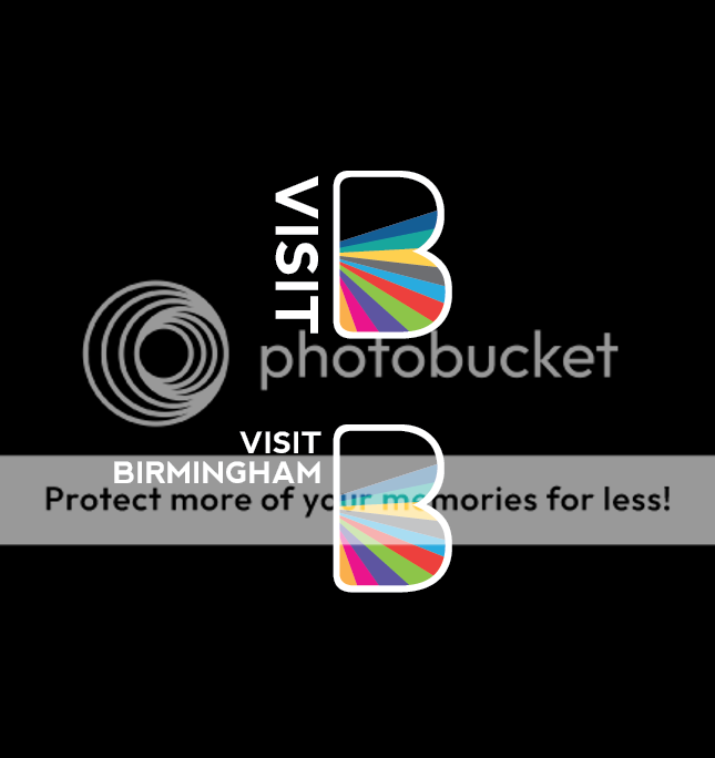
This is for a brief to design a logo for the summer Visit Birmingham (UK) campaign.

The main appeal of the city is its diversity and the vast array of cultures.

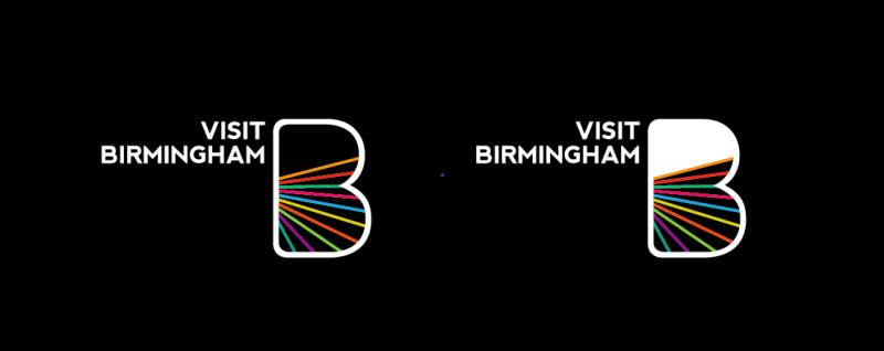
I was thinking to make variations of this idea, with different colours/styles, the logo is meant to represent the cities energy and youthfulness (one of the brand values/criteria in the brief is "Energizing Experiences")

The picture has 2 slightly different versions.
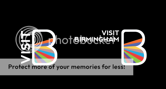
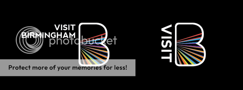
Screenshot2012-02-03at222614.png
 
Last edited:
This is just my own preference, but I would make the coloured lines wider and use less of them. Other then that I think it looks really nice :icon_smile:
 
I like the typeface you've chosen and I like the shape of B, but I'm not keen on the coloured lines. I get that they're meant to represent different cultures and diversity and what not, but it just looks like they're plonked in there. But if I had to pick one, it'd be the one on the left.
 
Have a look at the identity/logo design created for the Bowery Museum in New York, here they have used the outline shape of the building in a similar way to the B in your design concept.

The design has a template in place where everything else changes around it, making it dynamic, similar to the vast array of cultures in Birmingham.

This approach could be used in your idea, it is possible that you could keep the typography and the big B as your template, remaining constantly throughout all designs, then create the variations you have mentioned to represent the different themes around Birmingham.

This creates one identity that instantly visible and recognisable but also sub categories that then below to the main identity.

Sorry i cant post a link for the work i have mentioned before can't find it just now but have it in one of my research files- - google it!!
 
Just to add to the thread, Thickened up the B outline and I am looking at different typographic approaches.

ScreenShot2012-02-07at183105.png
 
Last edited:
I like the very first set you did, the left hand side version. I think it works well and wouldn't change it.

Are you using a vector programme for this, your lines all look a little pixelated?
 
Back
Top