You are using an out of date browser. It may not display this or other websites correctly.
You should upgrade or use an alternative browser.
You should upgrade or use an alternative browser.
Improvements required
- Thread starter Davesheps
- Start date


Martin Scurry
Member
you need to add image of teeth somewhere in logo so it would be get idea by someone in first watch.
Like I said I have created a design, also there is no need to leave feedback of its not constructive. I've asked for expert help which you clearly cannot provideFirst of all, that's a label design, not a logo. In all honesty, there's far too much wrong with it to offer
an appraisal of it. You need to hire a designer.
Like I said I have created a design, also there is no need to leave feedback of its not constructive. I've asked for expert help which you clearly cannot provide
you have not provided anything to go on Sir if you can attach your design you have created for your logo then it can be criticised and appraised, as pointe out this is a label design not a logo design and it is what you have attached.
- however do not expect expert advice and ideas for free, you won't get that here. most of us are working and available for hire though.
Do you think being the writing if it had teeth would be a good idea?you need to add image of teeth somewhere in logo so it would be get idea by someone in first watch.
you have not provided anything to go on Sir if you can attach your design you have created for your logo then it can be criticised and appraised, as pointe out this is a label design not a logo design and it is what you have attached.
- however do not expect expert advice and ideas for free, you won't get that here. most of us are working and available for hire though.
That's fine I do not expect anyone to work for free. I have attached a copy of the design we made ourself above in the post anyone who is willing to help just let me know and how much it will cost so we can get something set yp
That's fine I do not expect anyone to work for free. I have attached a copy of the design we made ourself above in the post anyone who is willing to help just let me know and how much it will cost so we can get something set yp
i will be willing to help however i am at work so i can't right now, the only thing i would ask is could you provide more of a brief as i am in agreement with Wardy here, it would be much better if someone could start from scratch.
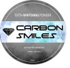
The design is for a sticker sized 60mm
X 60mm. This will be going on a metal tin containing activated charcoal teeth whitening powder. It's 100% Natural and would like to aim it at 18 to 30 year olds both male and female. The name of the company is carbon smiles. Let me know if you need any more info
X 60mm. This will be going on a metal tin containing activated charcoal teeth whitening powder. It's 100% Natural and would like to aim it at 18 to 30 year olds both male and female. The name of the company is carbon smiles. Let me know if you need any more info
Paul Murray
Ultimate Member
From my perspective, it lacks any real sense of a brand. It's cold and industrial and feels more like boot polish than tooth whitener. The name and product have something of a humorous feel to them – it's charcoal (black) that you apply to your teeth to whiten them. That's ironic, and one possibility is to play on that with some humorous or informal branding. The design itself doesn't really say much about the product. What does "100% coconut" mean? I assume the charcoal comes from coconut?
Chances are a fair few 18–30ers using this for the first time will want to share images of their blackened mouth on social media (especially female groups), so it would make sense for the branding to feel lighthearted and to be ok with people almost mocking its use. The grey background and industrial font you currently have, make this feel very masculine and more like something you'd find in a shed or sold in a petrol station than on the shelf in Boots.
Chances are a fair few 18–30ers using this for the first time will want to share images of their blackened mouth on social media (especially female groups), so it would make sense for the branding to feel lighthearted and to be ok with people almost mocking its use. The grey background and industrial font you currently have, make this feel very masculine and more like something you'd find in a shed or sold in a petrol station than on the shelf in Boots.
Great feed back thank you I think you are correct it's 2 men that designed the product so we struggled to feminise it without alienating the male market.From my perspective, it lacks any real sense of a brand. It's cold and industrial and feels more like boot polish than tooth whitener. The name and product have something of a humorous feel to them – it's charcoal (black) that you apply to your teeth to whiten them. That's ironic, and one possibility is to play on that with some humorous or informal branding. The design itself doesn't really say much about the product. What does "100% coconut" mean? I assume the charcoal comes from coconut?
Chances are a fair few 18–30ers using this for the first time will want to share images of their blackened mouth on social media (especially female groups), so it would make sense for the branding to feel lighthearted and to be ok with people almost mocking its use. The grey background and industrial font you currently have, make this feel very masculine and more like something you'd find in a shed or sold in a petrol station than on the shelf in Boots.
You are correct we would like the package to be appealing so it can be used by clients on social media. We thought of maybe a black and white theme to coincide with the black product white teeth?
You are correct the charcoal is made from 100% coconut which we would like to highlight. As it does not involve dangerous chemicals or peroxide like alot of other products
Levi
Ultimate Member
There are plenty of people on this forum who will be happy to make a design you are happy with, what you will need to do is post up a brief of what you need in the tenders section and the relevant people will give you quotes as to how much it will cost. You can then accept one after viewing their quotes and portfolios.Anyone able to help me improve the design?