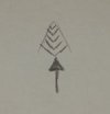
I'm new here, please critique my motorsports company logo!

cabaynes

New Member
My partner and I have decided to get our motorsports company off the ground. We initially started with the name and then developed the "RM>" road-sign logo element you see on the left and then proceeded to try to find a matching typeface/font design that we liked. Well after a couple months of trying, we eventually had moved so far away from the inital design and even the "RM>" element had been modified so much we felt lost. I came up with the design you see below by going back to our original design that we liked and found a font that I was able to modify (by adding the underline) that I felt represented the brand well. Please view all the versions below and comment on anything you feel. Also, please consider the left vs. right justification of the word "motorsports" and let me know your opinion.

Many thanks for any and all feedback. Much appreciated.
Charles

xiLg3dJ.jpg

Z0NtAsS.jpg

3o0EhPb.jpg
 
Welcome to the forums cabaynes,

I like all the designs that you or your friend have made, I would have to go with the bottom design as to me it feels the most appealing to look at.

Hope this helps! :)
 
I really dont know why people like that bottom one. The final T into the D just looks wrong. Number two works far better
 
I'm with Jooty although I don't really like the 'motorsports font' and don't necessarily think it needs to touch the line above.
 
Bottom one is the best of the bunch - however I would test with random profile public and ensure comprehension. Words mergin may not be clear for the end user in practice.
 
I don't mean to be negative but I am surprised people like any of them as none of them work well at all. If I had to choose out of everything, I am more impressed with the 'mark' but even that is quite weak. I look at these 3 options and think of a heart monitor that has flat-lined, spelling the word REDWOOD; look at the underline into the 'W' that really shows this even more so. The fonts are just horrible. The compositions do not work: I understand your idea with the underline crossing the 't's in the word 'motorsports' but it just doesn't work well and does not look good. For one, the underline is too thick for it you look natural enough for a cross of a 't' due to the sizes/thickness's of the fonts being different.

You need to create 3 totally different designs, with different fonts, different compositions, different colours etc. At the moment you have 3 of the exact same design just moved about a bit. When you've done that, you will be able to see what works and what doesn't and progress onto a final design outcome.

PS. You can find nicer fonts that that.
 
The bottom is the best of the bunch but Id change it up completely. if thats taken to 1/4 of the size its not legible.
There are a lot of ways you could make that into a more 'solid', legible logo. Id start by lessening the kerning of Redwood.
x
 
I like the concept, but i think the fonts are wrong, especially as I keep reading it as RFDWOOD because the underline is making my eyes think the E is an F, also the motorsports font needs changing as the balance between the two dont match.

I agree with CLHB when you should come up with a couple of completely different designs, rather than having one set idea and manipulating the position of the 'motorsport' work from this idea to develop the logo further.

All the best.
 
They really hurt my eyes - personally I wouldn't call this a "logo" just font. It really needs something, something to wow people and I'd do away with the squiggle. I can see what your trying to do, it sorta reminds me of that Hot Rod Designer, Boyd Coddington a little.
 
Back
Top