You are using an out of date browser. It may not display this or other websites correctly.
You should upgrade or use an alternative browser.
You should upgrade or use an alternative browser.
Icons
- Thread starter Fruitbat
- Start date
spottypenguin
Active Member
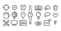
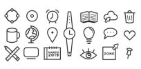
They're not bad, maybe a little "flat" but certainly OK to use. I think maybe one thing I would look at is the strokes - the simple lines are maybe making them less eyecatching than they could be. If you after simple icons then I think you have achieved that; if you are going for something more appealing then maybe think about using a very light grey as shading and giving them a bit mroe form?


