I want your brutal, honest opinion on this logo asap!

lunapea

New Member
talklip.jpg

Please, I would like your professional opinions on this logo.

It is for a health charity whose aims are to form a support and awareness group about a rare lymphatic condition.

It is not my logo, but a logo that a friend (who owns a marketing agency) has designed for them and they have requested that I use it while building forums and newsletters.
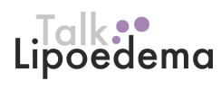
 
It could be a lot better.

'Talk' just seems to have been dropped in there with no real thought. If that's supposed to be a speech bubble, it looks more like a balloon or pin as it's 3d, and it's not pointing
at anything in particular. It should be in outline with 'Talk' inside it maybe.
 
It could be a lot better.

'Talk' just seems to have been dropped in there with no real thought. If that's supposed to be a speech bubble, it looks more like a balloon or pin as it's 3d, and it's not pointing
at anything in particular. It should be in outline with 'Talk' inside it maybe.

Good ideas, thank you.

How do you feel about the font? I take issue with arial personally.
 
Could be better but it serves the purpose I suppose. Agree about that 3D effect on the speech bubble too.

How do you feel about the font? I take issue with arial personally.

I would never use Arial in anything, save for digital stuff, and even then I'd opt for another font before I resorted to that. This font doesn't look like Arial to me though, looks like Helvetica (not Helvetica Neue) judging from the 'e'.
 
I would certainly say dont use those fonts whatever they are, use unique fonts maybe a serif font for (talk) and sans serif for the other. needs to look softer I think. Certainly move the talk, it does look like its been dropped on the design. Have the type on on line and maybe turn the 'o' of the Lipoedema into the speech bubble? worth a go.
 
It seems like the logo was made in the 1990's. It looks really outdated and boring. I suggest looking at other business's that are the same type so you can get a good idea of what there all going for (but dont copy them, get the ideas and change it slightly so it stands out).
 
You don't need the shadows that are going on.
Take it right back to basics, use a more 'solid font' better kerning, watch the leading and use a font with a shorter X height.

These examples are just thrown together and aren't fit for submission at any means but just an example of how other fonts could work.

Screen Shot 2014-01-27 at 22.31.00.pngScreen Shot 2014-01-27 at 22.32.06.png
 
Hi I have to agree with Fruitbat above. The 2 new logos are an improvement which shows there is still a lot more work to be done. Why use the word talk? What about awareness? That's what the Charity is trying to raise. The purple softens the logo and makes it more accessible. Lipoedema Awareness makes the reader curious and want to read on.... Why would you want to 'talk' about something when you haven't a clue what it is!
 
Back
Top