Corabict
New Member
Hello, This is my first topic, and I'm a beginner that is looking to improve
So this is a logo for a friend, I use it as an exercise to learn, so I put on the work doing some sketches, and at the end, I came up with 5 ideas.
I upload 5 images, one for each logo and the concept behind it. Then an image for all the logos together ================================
Brief:
Mahmoud Mohamed: A web developer working as A freelancer, using PhP and he loves developing websites.
Most important points to show through the brand:
Structure.
Respect.
Simplicity.
Friendly
Functional.
Flexibility
Typography:
I chose Sans serif fonts to read structured and modern.
Color:
I chose to work with blue as it's convenient with tech related things.
================================================== =====
I would like to hear everyone's feedback without holding back even a little, I need you to tell me why and why not each one of those logo work?? what did I do wrong especially in terms of typography?
Thanks in advance
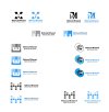