illadeligut
New Member
Hello and thanks for reading this.
Apologies for the re-post, I couldn't figure it out earlier so the image got pushed way down the thread and I didn't want it to get lost.
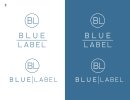
This logo is a re-brand for a high end wedding band in their 6th year, located in the Northeastern United States.
Personally I think the font used for the word "Blue" is no good from a logo design perspective and will be difficult/blurry to read on far away prints.
Also I think the character spacing on Blue is a little wide.
Would it be neat if the circle started out slightly wider and tapered to a point at the end?
I would appreciate anybody's honest thoughts on any of these points and anything else, thanks!


