You are using an out of date browser. It may not display this or other websites correctly.
You should upgrade or use an alternative browser.
You should upgrade or use an alternative browser.
House of Nod - logo
- Thread starter Deadletter
- Start date
Deadletter
Member
What is wrong with the bottom bit? It is pretty much the logo =/
spottypenguin
Active Member
What is wrong with the bottom bit? It is pretty much the logo =/
CLHB got here before me but the bottom bit was putting me off too, especially the difference in weight to the foundations and the root thingies although I would have kept the 'underground' bit and just lost the roots
spottypenguin
Active Member
You could of course move it all around (again this is only quick)
http://i45.tinypic.com/2cf2r0n.jpg
... also not sure the perspective of the windows in the roof is quite right. I think what is really bothering me is the almost simplistic shapes of the house compared to quite dramatic rips etc. this is probably intentional to emphasize the ripped up effect but it's just annoying me lol .... don't take it personally, it's all subjective
Last edited:
@GCarlD
Well-Known Member
I just think its too overworked for a logo with the 'underground thing.' You already have windows, a front door, a cross on the roof, attic windows... All your missing is a chimney and a back garden. Sorry I don't mean to be rude, I just think it needs to be dumbed down and with the 'underground' it is just going too far. The more you work into this, is the less it will look like a logo. Any more and it will just look like a drawing next to some text. Again, I apologise, I know how difficult these things are and I really like your ideas, it just needs a final tweak for it to be complete.
spottypenguin
Active Member
I think you're probably right CLHB, there is a fine line between a logo and 'an illustration with text'.
Again Deadletter I just want to reiterate that this is nothing personal, just opinions
Again Deadletter I just want to reiterate that this is nothing personal, just opinions
Deadletter
Member
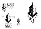
Okay I have taken all your critique on board, and I have decided to present the logo in 4 versions which can be used however the publisher wants. I have the OTT illustration, which is free of text. One which is sans underground and a version of that small recommended by CLHB. I also have a version which underground sans roots as spotty recommended.
I have also tidied up the edges and flipped the top windows to be blocks rather then lines.

I have also tidied up the edges and flipped the top windows to be blocks rather then lines.

spottypenguin
Active Member
Way to go, now get submitting and wow your client :icon_biggrin:
Deadletter
Member
I quite like the bottom root section. It's the top house bit I don't like. It looks a lot less considered and pretty rough compared to the bottom. :icon_cheers:
I guess this is just further proof I can't please everyone. One lot saying destroy the bottom, the other saying destroy the top.
Theory Unit
Member
You only have to look through the current Los Logos book to realise anything is possible in logo design and that there are way more complicated logos in use than this one - I think for the 'genre' market you're targeting here it's entirely appropriate. Good stuff.

