Here is my first Logo design project, What do you think

cfnbnfnm

New Member
Hello everyone , I'm new here I've been learning graphic design (edit ;)) for some time now, I'm currently doing my first branding project, it is actually a conceptual project and the brief was generated online

here is the brief

Company Description: We are a company that makes and distributes Indian food. Our main product is made with a secret recipe and available in stores worldwide. Our target audience is college students. We want to convey a sense of importance, while at the same time being gentle.

Job Description: You must create a logo using the information given in this brief. They would prefer a lettermark that uses the color orange. The logo will be used on the company website. Take into account the company's values and preferences, and make sure it will work for the planned use-cases.

And here is the result:
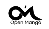

Open mango_vertical_RGB_black-2.png
Open mango_vertical_RGB_full color-1.pngOpen mango_horizontal_RGB_full color-1.png
What do you think, Do you think this still counts as a lettermark?
 
Last edited by a moderator:
Personally I'm not keen on the OM. It seems a bit contrived and needs some refinement at least. The leaf should be bigger.

Most of all though I think there is far too much emphasis on the mark. Don't forget this is for packaging. The name should be dominant, not the mark. I did a quick search for 'Indian food packaging'
and there are not many letter marks as such. I would go for something very simple like a M inside a O and made into a sun or something. I'm even wondering if they mean lettermark as opposed to wordmark.
Open Mango should be a lot bigger than the mark.

(May have been a typo, but please call it 'graphic design' or 'graphics') :)
 
Thank you very much for your opinion, I'm not a big fan of the initial o.m too but that's what I have to work with, as regards the mark, I wanted it to be distinct and easily recognizable, and since it was meant to be a lettermark I placed more emphasis on the OM but I'll be changing that up to bring the name along. Thanks for the correction too, is there anyway to edit the post here??
 
Sorry, that was just me being pedantic.

With regard to OM I just think you're trying too hard. Keep them simple and recognisable, maybe in a decorative font. They're such diverse figures, there's not a lot one can do to merge them.
 
Sorry, that was just me being pedantic.

With regard to OM I just think you're trying too hard. Keep them simple and recognisable, maybe in a decorative font. They're such diverse figures, there's not a lot one can do to merge them.
I couldn't agree more the two are somehow tricky to pull off, thanks again
 
Hey, good work on your first project!

I'd like to mention a couple of things:
  1. The isotype (OM) appears considerably disproportionate compared to the logotype. Always remember that both elements need to be balanced.
  2. While I understand that using initials is a common technique nowadays, it has become the "easy solution" for many designers. I encourage you to explore the brand from perspectives other than just the initials, the brand name, and the "food" concept. This is where you can differentiate from competitors.
  3. It seems like you invested more time in working on the isotype than the logotype. Consider looking for alternative fonts that can better convey the brand's message.
  4. Be mindful of the mango leaf, as it might become less visible when the logo is scaled down. Always conduct logo sizing tests.
I hope you find this feedback helpful!

Cheers
Thank you very much for your kind words, I definitely spent more time on the mark, I really found this helpful
 
Hello everyone , I'm new here I've been learning graphic design (edit ;)) for some time now, I'm currently doing my first branding project, it is actually a conceptual project and the brief was generated online

here is the brief

Company Description: We are a company that makes and distributes Indian food. Our main product is made with a secret recipe and available in stores worldwide. Our target audience is college students. We want to convey a sense of importance, while at the same time being gentle.

Job Description: You must create a logo using the information given in this brief. They would prefer a lettermark that uses the color orange. The logo will be used on the company website. Take into account the company's values and preferences, and make sure it will work for the planned use-cases.

And here is the result:


View attachment 8653
View attachment 8651View attachment 8652
What do you think, Do you think this still counts as a lettermark?
Where did you get the brief?
 
Ah right so it's not a real brief.
I never heard of that website - thanks for sharing.

You've got some nice feedback so far - I do look forward to your iterations and solutions to what has been brought up here already.
 
Ah right so it's not a real brief.
I never heard of that website - thanks for sharing.

You've got some nice feedback so far - I do look forward to your iterations and solutions to what has been brought up here already.
You're welcome, well I plan to develop an entirely new concept to solve the problems this particular one faced.
 
Back
Top