You are using an out of date browser. It may not display this or other websites correctly.
You should upgrade or use an alternative browser.
You should upgrade or use an alternative browser.
Help with my logo
- Thread starter Kev Clarke
- Start date
Well ihave finally chosen a domain to showcase my portfolio, and to attract freelance work - hopefully!
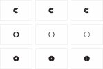
The domain is simply kevinclarkecreative, i have attached a sample of my final designs for you to have a look at, let me know your thoughts. Cheers...
Hey semiproflea,
At the mo I can't see what these designs are or what they would be used for...could you explain?
Kev Clarke
Member
Feed back required on logo
Cheers for that tezdread,
"Well ihave finally chosen a domain to showcase my portfolio, and to attract freelance work - hopefully!
The domain is simply kevinclarkecreative, i have attached a sample of my final designs if you would be so kind to have a look and let me know your thoughts. Cheers guys..."
The role of this logo will be business card, letter head, website etc...
Attachments
Cheers for that tezdread,
"Well ihave finally chosen a domain to showcase my portfolio, and to attract freelance work - hopefully!
The domain is simply kevinclarkecreative, i have attached a sample of my final designs if you would be so kind to have a look and let me know your thoughts. Cheers guys..."
The role of this logo will be business card, letter head, website etc...
Sorry, I don't always explain myself to clearly :-/
What I mean is that I see a C and O in the designs but how does this relate to Kevin Clarke Creative?
I just fail to see a connection between the images you've done and your name and what you do.
Kev Clarke
Member
Do you not see 2 c's. There is a 'c' for clarke and creative. They have also been placed to form a circle, an ancient and universal symbol of unity, wholeness, infinity?
Cheers for your feedback, all is welcome
Cheers for your feedback, all is welcome
Do you not see 2 c's. There is a 'c' for clarke and creative. They have also been placed to form a circle, an ancient and universal symbol of unity, wholeness, infinity?
Cheers for your feedback, all is welcome
Hey, now you point it out yeah I see now and the CC inside one another it's clever but not obvious and that's not a bad thing as long as that's what you want.
I get the thoughts behind the circle but a circle can be interpreted in lots of ways no? For example, the NSPCC use a big green circle as a full stop and it's backed up with text in the tag line.
Without really knowing what message you want to give with your logo I couldn't possible say whether your hitting the mark.
I do think that what you have got is abstract and doesn't give any insight on it's own what it relates to.
Why have you chosen to exclude K from the logo?
Paul Murray
Ultimate Member
The 3rd image on the top row reminds me a little of the OCP logo from the Robocop films 
I think the break in between the halves on the 2nd and 3rd rows needs to be a little bolder, just to clarify that there is a definite break there. The line thickness of the break within the design on the top row I mentioned is bold and clear.
Have you considered adding a vertical line to the left of the C's to form a rudimentary K maybe, so you've effectively got KCC?
Good luck with this. I've yet to start on the frustrating and frightening endevour that is personal branding because I'm honestly just too scared!
