Help with font selection for my logo

tezdread

Member
Hey all,

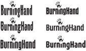
I spent a couple of days going through several thousands fonts and narrowed that down to 30 now I have 6 left and I would like to know which of these ppl think best work with the graphic.

Thanks

Oh yeah I've lowered the i in all of the examples
 

Attachments

  • font-selection.jpg
    font-selection.jpg
    20.4 KB · Views: 35
I think either the bottom left or top right ones work well. Not so sure about the others. You should have made this post a poll ;)
 
I agree. Top right for me. Some of the others look too condensed, or like you've artificially condensed them. Also, not sure about the short 'i'. Doesn't really need to be shorter IMO.
 
Thanks all,

The top left it's going to be (and I'm happy it is!), I've been asking ppl on\offline with and without any GD experience and the top left is the winner.

The reason for the adjustment to the i was just to make it a little more individual, I don't think it causes an issue but if it's really unnecessary I'll leave it at the original height. Would like some more feedback on this part though.

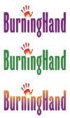
In these next examples I've added colour using the complementary colour guide, using the red in the hand as the primary colour and the purple and green are the colours that were suggested. The third uses the suggested purple and the orange from inside the hand to form the gradient to enhance the glow effect.

I'll work on the colours but what do ppl think so far?

Thanks
 

Attachments

  • logos-w-colour.jpg
    logos-w-colour.jpg
    88.1 KB · Views: 14
Didn't everyone say top right? The 'g' in the one you've gone with is a bit yewww...

'grimace' oh boy...I read top right but saw top left and the choice is split between the two...I'm not over keen on the g either but do like the (top left) font...
 
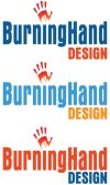
Here's the logo with the second font (suggested by ppl here) with colour and the other text. Again using complementary colours based on a couple of colours within the hand.
 

Attachments

  • newlogo-colours.jpg
    newlogo-colours.jpg
    49.1 KB · Views: 13
Disagree with the idea that the shortened 'i' is unnecessary; the link with the hand/flame device (as a substitute for the dot) is stronger when the 'i' is picked out in this way.
 
Disagree with the idea that the shortened 'i' is unnecessary; the link with the hand/flame device (as a substitute for the dot) is stronger when the 'i' is picked out in this way.

You know what, I think I agree. The shorter 'i' was better. The hand looks a little small in relation to the type now for me. And I still think the word 'design' seems to dominate. Other things - have you squashed that font or is that how it came? The proportions are a bit odd. And I'd tighten the letterspacing a bit.

Definitely getting there though.
 
Thanks for the replies.

Maybe necessary\unnecessary may have been a bad choice of words...

I don't think it is absolutely necessary to make adjustments to a font that has already been designed and crafted (by better than I, otherwise I wouldn't use it) but maybe a change will enhance it and make it that bit more individual.

I would bet that the Nike text has a particular angle on its slant that is unique to it.

So the question is; does lowering the i enhance the overall image\message or does it diminish it?
(I obviously thought it would enhance it in a subtle way)

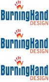
Here are 3 versions. 1. without any change, 2. with the i being lowered to the outer curve, 3. lowered to the inner curve. (still got to choose the best font for the word DESIGN)
 

Attachments

  • all-about-the-i.jpg
    all-about-the-i.jpg
    48.5 KB · Views: 8
Agree: the third one's the one, although I'd echo the comments above about the font (I also dislike the downstroke at the bottom-right of the capital G).
 
Thanks, I think it's finally getting there...

The only changes I've made to the main font (Aura) is with the kerning and tracking.

ATM the kerning is set to Optical & tracking is at 25.

I don't know if there are any particular rules regarding this area so can only do what I think looks right

I need to choose a better font for the word DESIGN
 
I'm done :)

I have worked hard on it and it's come a long way with help and advise from the GD community so I'm happy I stuck with it, took note and got myself a good (IMO) logo.

Thanks everyone!
 

Attachments

  • burning-hands-logo.png
    burning-hands-logo.png
    7.7 KB · Views: 7
Hi i think the design is ok but i have a better vision of it in my head. I can do a better job for you but feel it's something you should do. Have you thought of having a Symbol logo?
 
Hi i think the design is ok but i have a better vision of it in my head. I can do a better job for you but feel it's something you should do. Have you thought of having a Symbol logo?

Hey Peter, I'm happy with what I've designed but if you want to show me your interpretation of it I'm interested to see what you have in mind...
 
Back
Top