Help to correct this code

@GCarlD

Well-Known Member
Hi guys,

I have been trying (& failing) to 'teach' myself to code, as I would like to add a contact button in the middle of my website, bottom centre of 'My Services' section.
While by some miracle, I have successfully achieve to somewhat 'code' this button into existence, it places itself to the far left of the page at the top of my Blog section.

What do I need to add/edit from this code so that the button in 1/centred & 2/ moved up a bit so that it is near the bottom of 'My Services' section of my site?

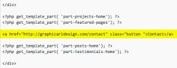
I have attached and highlighted the section of code I added to the WP editor (page-home.php).

I would really appreciate any help correcting this.

Thank you.Screen-Shot-2015-04-28-at-20.30.05.jpg
 
It's hard to diagnose the problem accurately without a live example, but here's a Codepen with a very basic button centered horizontally – http://codepen.io/COSMOSMCR/pen/bddNgB

My guess is it's a float/positioning problem. When I was first learning (I still am now), this was one of the harder aspects to get my head around. Anchor links are inline elements, i.e. they are used inside part of another element, such as a paragraph.

This means they often behave a little like text, so you need to pop them inside another div, and give the parent a text-align:center; CSS value. Then you can position that parent div and the anchor inside should behave itself.
 
Thanks Paul, I don't quite understand how this has worked but it has. Thank you very much, it has taken me nearly 7 weeks trying to figure this out.

Only thing is, is it possible to move the whole button up a bit, so that is it not so isolated from the above text?
 
Thanks so much Paul, I tried everything but that lol.

Things are so simple when you know how eh? All that time I spent trying to do this sorted out in a few mins.

Thanks again!
 
Like anything it's easy when you know how. :)

The other way to do it would be to change the padding/margins of other elements before it, but that's a bit messy and it's harder to diagnose problems when you're changing things on multiple elements.
 
Yeah I think at one point I was experimenting with the padding, but it was just increasing/decreasing the space below the button
 
Think I would have used display:inline-block on the button which would allow you to set a margin on it. Setting .wrapper { margin-top:-50px; }
sometimes has a knock on effect with elements either above or below the wrapper which position themselves according to the position the button was in before the negative margin on the wrapper pulled it up.

Yep, now you mention it, that's what I would/should have done ;)
 
Would you recommend I change the code to that then? What I currently have seems to be ok, and I am usually of the mind set of 'if it's not broken, don't fix it.' But you guys know far more than me when it comes to code, so if you think I should change it, please post the correct code that I should use instead.

I really appreciate the help/advice. Thank you very much.
 
Personally I'd leave it, at least for now, it's within a parent div that's within the flow of the document and it's certainly not affecting any other elements when you resize the page. The negative margin trick is somewhat of a hack, in the sense that it's probably not the best way to do something, but sometimes it does the job just fine. It really depends on what you're doing and the other elements around it. For example I often use it to force images to overlap for design appeal without having to mess about (too much) with absolute positioning.
 
Back
Top