Help!! Personal Logo Critique

jasmannan

New Member
Hi, My name is Jas Mannan and I'm currently developing a personal identity.

My aims for the logo include:

-Iconic
-Elegant
-Simple
- A color scheme which works on several backgrounds
- A logo which works well on several scales

This is what I've come up with so far...
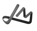
logovectorcolor2.jpg
Please let me know if you like it or not, or and/or any advice or criticism.
 
Thanks, oh yes I see what you mean, I'll correct that.

I drew it in illustrator, colored in Photoshop and applied a grain effect to give it some texture.
 
Thanks, oh yes I see what you mean, I'll correct that.

I drew it in illustrator, colored in Photoshop and applied a grain effect to give it some texture.

You say you created it in Illustrator and thats great, but I would be careful taking logos into Photoshop. Filters are an easy way to solve problems but you will find that most of the filters in Photoshop are achievable in Illustrator as vectors. You are restricting yourself by making it a bitmap.
 
You say you created it in Illustrator and thats great, but I would be careful taking logos into Photoshop. Filters are an easy way to solve problems but you will find that most of the filters in Photoshop are achievable in Illustrator as vectors. You are restricting yourself by making it a bitmap.

X2

... what he said :icon_biggrin:
 
I'm not very knowledgeable in illustrator, so I moved it into what I know best - Photoshop. Though I would have liked to have kept it in illustrator, allowing me to work with vectors throughout. I wasn't aware that I could achieve the same filters in illustrator, I'll look into that. thanks for the tips guys
 
I forgot to mention, my tutor didn't like it and told me that the logo looked feminine? : |

I don't see it as being feminine, but I may be wrong so what do you guys think?
 
I forgot to mention, my tutor didn't like it and told me that the logo looked feminine? : |

I don't see it as being feminine, but I may be wrong so what do you guys think?

I agree, but unless the tutor has said that it shouldn't look feminine then I don't understand why there is a problem. If the stipulation was that it had to be masculine then your tutor has a point.
 
No, they're was no requirement for a masculine look, so it may just have been a personal view? I just wanted a to design a logo that was smooth and elegant looking, as I feel this would best represent the type of work I look to produce.
 
I think its lovely but would agree with the others. Keep it in Illy...although I have no idea how you would get the same effect as, like yourself I was more comfortable in Pohotshop and am currently making myself explore Illy! Well done though it looks great!
 
I'd ignore your tutor, everyone has their own tastes and you will never ever produce something everyone likes. Definitely sort out the gap between the J and the M, apart from that, it looks good.. nice work!
 
I think its good, but you mentioned it was meant to be simple and i think its only simple in the sense of it being two letters, as the design of the type is actually not that simple. Personally, I think its a good starting point though! :)
 
Really like the look of the logo but the space, as others have mentioned needs to be sorted out. My only other crit, is not everyone will see the 'j' ... it looks like an 'L' as well. Maybe a slight touch at the starting point of the 'J', to the left, adjoined to it or away from it, might work, might not. Just my thoughts.
 
Back
Top