You are using an out of date browser. It may not display this or other websites correctly.
You should upgrade or use an alternative browser.
You should upgrade or use an alternative browser.
help needed on this icon into a Letter
- Thread starter JordanPlantDesign
- Start date


Not really sure you need the media buttons - to me it looks like it could be a video editor.

JordanPlantDesign
New Member
I like the first and last one definatly man nice one for the help and advice ")

scotty
Ultimate Member
Could you simplify more? I like Levi's but strip it back a bit more…needs crafting though!!
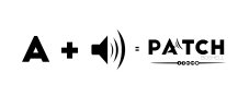
I just did the "squinty eyed glance" at that and it's starting to work for me in the sense I'm reading it as "PATCH" and then seeing the audio symbol.
It's might be a tricky one to get right but I can see it working.
JordanPlantDesign
New Member
Cheers guys for all the imput its helping me out alot going to do some more development on this to get it just right taking in all the ideas
Kapil Arora
Member
Hi Wardy,
I must say you have a good visualization. You placed the speakers in logo very smartly.
But JordanPlantDesign, I just want to know is there any specific reason that you want to show speakers on A alphabet only? I think using C for the same will be nice thought, unless and until you are not having specific reason for the same.
Paul Murray
Ultimate Member
Could the C represent an ear in some way? Or the T be a slider on a mixing desk?