You are using an out of date browser. It may not display this or other websites correctly.
You should upgrade or use an alternative browser.
You should upgrade or use an alternative browser.
Hello, i could use some feedback on my landing page design!
- Thread starter Dennisr
- Start date


fisicx
Active Member
Hi Denniser,
You need to consider that many people now use phones and tablets to browse. On these devices your layout may not work. And the background image is very tall - even on a desktop computer the content will be pushed down below the fold.
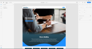
I can only see the top half of the homepage. What is below the hero image?
What do the inner pages look like?
You need to consider that many people now use phones and tablets to browse. On these devices your layout may not work. And the background image is very tall - even on a desktop computer the content will be pushed down below the fold.
I can only see the top half of the homepage. What is below the hero image?
What do the inner pages look like?
Hi Fisicx,
Thanks for your reply! I'm aware that most people use mobile devices nowadays. Thanks for your feedback, i will make the image a bit smaller. I haven't designed the other pages yet, just the landing page. The bottom part is not done yet, thats why i only shared the top part. i Appreciate your response !")
Thanks for your reply! I'm aware that most people use mobile devices nowadays. Thanks for your feedback, i will make the image a bit smaller. I haven't designed the other pages yet, just the landing page. The bottom part is not done yet, thats why i only shared the top part. i Appreciate your response !
fisicx
Active Member
It's not about making the image smaller.
Websites are best designed in elements. This means creating a wireframe with all your divs and classes and the content included. You then style each element on the page, testing on different devices as you go. For example, you may want to begin with the menu function - pull in the pages and style for widescreen, tablet and mobile. Test in landscape and portrait and make sure your touch elements meet the Google accessibility guidelines. Test different versions - with and without the hamburger, dropdowns, flyouts and animations.
Don't fall into the trap of designing the site using an image editor. You need to be designing on a dummy site so you can see how each element works.