Great Design Agencies - Non Format

dot design

Member
I'm a big admirer of the design work that Non-Format - produce, its very contemporary.
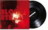
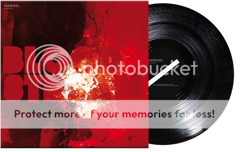
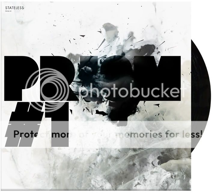
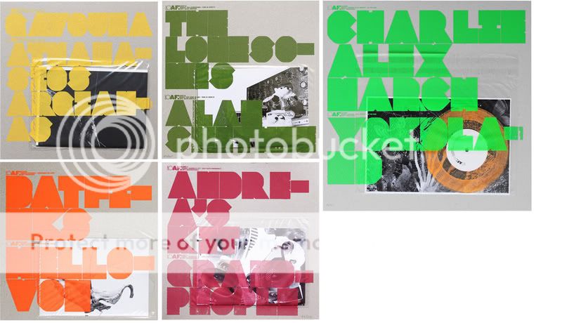
They experiment heavily especially in terms of typography, here are some examples below:

stateless-02.jpg
stateless-01.jpg
loaf-7-11.jpg
 

Attachments

  • stateless-02.jpg
    stateless-02.jpg
    69.6 KB · Views: 1
Nice.

Did they influence your branding?

We are working on a project at the moment which uses a similar blocky font construction. We are going for an abstract typeface - What do you think? The concern is the first letter isn't clear enough.
Can you read it:

Glow logo.png
 
I like it but I'd question the "G" in terms of clarity like you said.

Do you need the glow effect, I know its called glow but I'd question that.
Also maybe some work needed on the "W"

Overall though its looking good, :icon_thumbup: its hard to get typefaces right when you create your own, but I think your nearly there.

What does anyone else think?
 
Back
Top