Why go to <<removed>> when you get it done here for free...
When you get home tonight there'll be an extra storey on your house!
When you get home tonight there'll be an extra storey on your house!
Last edited:


Pro… Logo… <<removed>>… does not compute…
Agree, same with the R in Dragon. Ideally they should be the same or close to the width of the A and V. Currently they look a bit weak. I'll try and find some fonts I'd recommend.
*Edit*
Something like Lato Black maybe? It has curves to some of the edges, so it's geometric and 'heavy' but also slightly organic, like say a dragon???
View attachment 4698
")
 Sorry about vanishing (surely some relief ) but I think I have a final version, thought I'd show it as you folks were so helpful.. (Please god let it be ok lol) I've redone the text to keep the X,y scaling original, stretched out the R and U, edited the dragon head now in version V.18.12,1g..
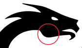
 It's ok, but it's still saying goat to me, too friendly. I would go something like this, with sharper angles etc.
Even if it is looking like an Irish wolfhound!