Genius Logo Design

Stationery Direct

Administrator
Staff member
After seeing Col's clever use of a thistle and the letter A, I had a quick look online for some other genius logo designs...


logo1.jpg

Incorporating a leaf.


logo2.jpg

Clever use of the number 8.


logo3.gif

Fish and hooks.


logo4.jpg

Exclamation marks, talking!
 
logo5.jpg

Guild of food writers, pen nib and spoon.


logo6.gif

Incorporating the letters E & D into a plug and socket.


logo7.jpg

Clever use of negative space, plumber and plunger.


If you know of any more, post them below.
 
Love the Guild for Food Writers. It's a really nice logo.

Don't forget the ultimate use of negative space (and the one that gets pulled up every time logos are discussed!).

fedex_logo.jpg
 
Negative Space

Some great examples, many of those I haven't seen yet either.

I'm not a fan of the Logomotives logo though, it's clever but I find it cluttered and ugly.

Amanda
 
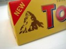
Toberone originated from Bern, a city in Switzerland that is rumored to mean as “The City of bears”. Now do you see the yellow bear in the logo of Toberone's Swiss Alps? Pretty sneaky eh? Its nice to see a little known fun fact being hidden in such a popular logo.
 

Attachments

  • toblerone-logo-hidden-message.jpeg
    toblerone-logo-hidden-message.jpeg
    12.8 KB · Views: 10
Back
Top