

Graphic Detail
New Member
Hi All,
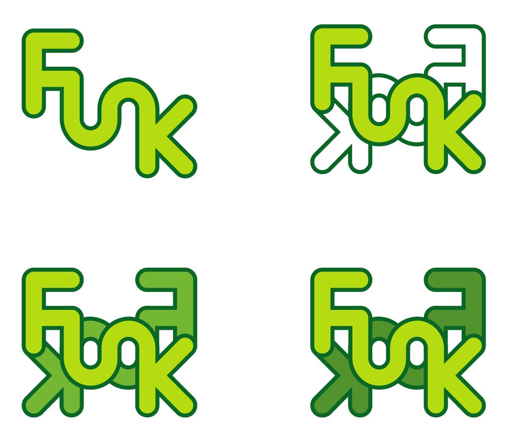
Im in the process of designing a logo for a client who's opening a venue which is a nightclub/bar. The name of the venue is "FUNK" the client wants a unique logo which looks well erm funky i guess.
Ive attached a few variations
3 of which are the same with slightly different colour combo's ive flipped the word Funk and place it behind as i think this adds some interesting shapes/elements to the overall design, but undecided if this enhances the logo design or makes it a bit too busy.
Colours are subject to change so looking for feedback on the concept.
Thanks in advance.
Paul
Last edited: