Food Store/Brand Logo - thoughts?

mattfrodsham

New Member
Hi all,
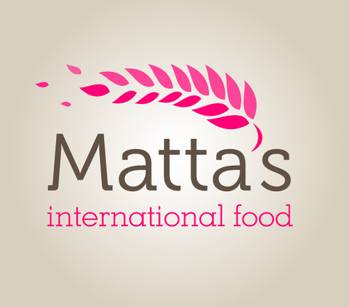
This is a college project in quite early stages for a shop that sells international food ingredients, vegan food, organic food etc. so it has to be quite neutral in terms of what the shop sells but a welcoming feel and a quality aesthetic are a must I think as well as looking quite cool to appeal to the younger generation of cooks as well as the ethnic families who would use it for general grocery shopping.

I will eventually be developing a brand identity and all the accompanying material so while I haven’t got that long to design the logo itself I want it to be high quality to support the rest of the work.

many thanks in advance, Matt

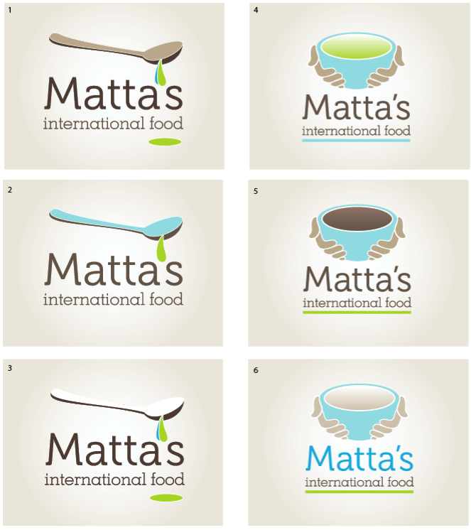
ps. it has been pointed out that the third looks like a logo for a company called pangur so that one while possibly the most successful in terms of simplicity is pretty much out the running

7FA8FD76431646CAA7B2EA2A3347D87E.jpg
 
Good work Matt,

I think the first one is the most successful, in terms of it being contemporary, friendly, warm etc. The last one does remind me of several other logos so I'm glad you avoiding that one

What is the font you have used for the main text?
 
thanks, I've had a few people say they like that but some say it looks like an aid organisation (begging bowl rather than offering) so I'm having a tough time! The typeface is museo - it's a nice free one I found somewhere, the second also looks nice with that font and different colours but not many seem to be hot on that one.
 
3053997284_5cc7ee9359_o.png


better? worse? I'm worried there's not enough of a food vibe, but how to represent the whole of 'food' and appeal to all these markets?
 
3055910320_a95f4d9b81_o.png


some more experiments, using a bolder type weight and more earthy/food colours. Also seeing how it will look grey & black. The general opinion is that the bow was best but looked like an aid organisation, hopefully the steam will make it more appealing
 
I can understand the "begging bowl" complaint having thought about it and viewd your design abit longer.

Do you need the thick line under the whole thing?

I prefer the blue bowl version (1) but with the warm vertical lines of 6, the swirly line could work if it was a little smaller and liner, its abit clumsy at the moment.

But overall I think your nearly there, I like it, its classy but modern/slightly trendy in an organic/green way.

Good work.
 
getting too many charity comments from around the world, back to the drawing board on the image... here's hoping I get a client with a load of hungry kids soon ;)
Anything? Wanted to keep away from this but I've tried to contemporise it (is that a word? firefox is saying no). This is just a really quick sketch I'm just throwing the concept around

3057899749_65aaf26e8e.jpg
 
Good work Matt, really think this is working well.

The illustration is nicely integrated into the typography by way of the apostrophe.

Would be worth trying it without the brown background, just on white, to see how strong it is, as I'm guessing it won't always appear on that brown bg?

Like it though.
 
yeah I've got Illustrator artboards coming out my ears with all the eventualities, this one isn't too bad even on black (with the type colour lightened) not that it'll get used on black. Obviously because it's so simple in terms of line it works in black & white well too and small. Not got time to upload at the minute but I'm sure you can take my word for it on this haha

cheers
 
Hi Matt,

I much prefer this one over your earlier versions (they were still good designs tho). Like Dot said, it would be cool to see some on a blank bg.

keep up the good work!
 
All very good efforts, very professionally presented too.

I do like all the ideas, and the 'international food' font works really well I think.
 
Solid

It's a good solid concept but is there something about the leaves that need tidying up in some way?

Are they too spaced out or something? I'd tweak with them a bit further.

Maybe you need to get a curve drawn below it, and then ensure the leaves exactly follow the line of the curve...you know the central area between the double rows...ensure they follow an accurate curve shape.

Colours aren't bad, but I'd also work on those a bit as well and view some different options.

Good work though, some good concepts overall :)


Best Wishes

Amanda
 
Back
Top