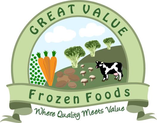
Food, ribbon badge style logo

Anglo Design

New Member
I wanted to have a go this morning at creating this style of logo with an illustration which sends the message of good food/veg. This is my first attempt at this kind of logo, and took a fair few hours. I wanted to post it where I'm at, to get comments on how I would go about improving it. Some bits are too complicated, and some bits too badly drawn, I need to find a balance. Also the rounded reflection/glare effect I've tried to create doesn't look good, as I need to learn the proper way of doing that.

How would I improve it, and make it more simple without loosing the detail of the scene I'm trying to create? And tidy it of course... :icon_rolleyes:

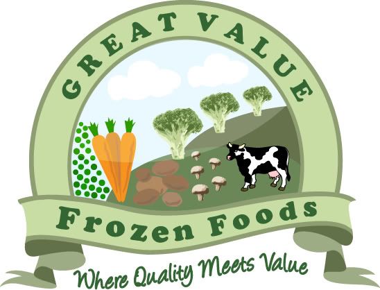
frozenfoods-1.jpg


frozenfoods.jpg
 
Last edited:
Its not a bad start :icon_thumbup:

I would forget trying to do the 'glass/reflection' effect as it doesn't suit the logo you are trying to create. It will be better without it.

Try to have the scroll where it says 'Frozen Foods' the same height all the way along, rather than it getting thinner as it moves to the right. That way the words can be the same size, it looks a little lop sided at the moment.

Make the text that says " Where quality meets value" flow along the same curve as the scroll part above it (the frozen foods part).
 
You're dead right, I've made the changes.

frozenfoods2.jpg

I think my peas and carrots need some work. I'd like to keep my strangely lined up broccoli-trees and mushrooms. I think my carrots and peas need to match the style of them maybe.
 
the broccoli and mushrooms look like they may have been photos that were vectorised using something like live trace.

Try taking in a photo of a real carrot / peas into illustrator and do a live trace on them using the colour 16 option. You might get the result you are looking for.
 
Thoughts

A thing to consider is the legibility of all of this detail at small scales - fine if used at A5 and upwards, but a lot of this will choke up at letterhead scale.and what happens when reproduced in greyscale/black and white?

You do have a mixture of traced photography and simple drawn elements which feels messy.
Do you really need to depict every food group on here? Think of what 'frozen food' is and perhaps this could help simplify. The logo doesn't have to be so literal.

Suggest ditching all of the food imagery and keeping the fields and sky, but using the FROZEN FOODS lettering in the centre over the top of the field and moving the 'Quality meets value' bit onto the ribbon'.

Very helpful comments there, much appreciated. :icon_thumbup: I'll take on board and have a play with it again.

the broccoli and mushrooms look like they may have been photos that were vectorised using something like live trace.

Try taking in a photo of a real carrot / peas into illustrator and do a live trace on them using the colour 16 option. You might get the result you are looking for.

Yeh you're right, I used live trace for the broccoli & mushrooms. I'll see tomorrow what I can do with this logo. Cheers bud.
 
Last edited:
Tips

It's a very good start, also to think about;

- Don't forget that things can go 'off the frame' a bit. ... ie sides of the cow and veg can go behind the circle, this allows them to be larger within the scene and thus show up better when the design is used in small size. It will also reduce the feeling of clutter.

For instance move the cow to the right and lets have it's bum half hidden behind the circle as if it's just moving out from behind it, then should be able to increase it's size if you want.

- Perspective. Create a feeling of perspective. Try to make elements appear as some are in the foreground and some are in the background. This makes the scene feel more real and less like objects placed in a space. Moving the resizing the cow will help and perhaps making the carrots larger, off frame a bit, and in the foreground opposite the cow.

- Try to be consistent with illustrative style across the scene. For instance the cow has black outtines around it, but the other items do not.

Hope that helps a bit

Amanda
 
hi anglo

like the concept works quite well

i agree with previous comments about the peas and carrots .. but it also seems that all of the elements seem to have different weighting ie the cow jumps out yet the potatoes seem to fade into the background ... i would try simplifying it down a bit maybe a few less elements.. maybe pile ur peas like on the front of a bag of frozen peas for example.

keep working on it and try it at different sizes too bud

ross
 
Back
Top