Flyer Leaflet Design

Marketing!

I may be pants at design but I do understand marketing.

On the front put something like: "Weekly opening in X, Y and Z. See back for menu and locations". It acts as a call to action.
Sorry I'm with Hank on this, there is no need to force the map onto the front. It's a two sided sheet of 'paper' it doesn't need the principles you'd apply to a website, we have long established natural behaviour when it comes to flyers.....

Assuming you just don't bin or refuse the flyer, when was the last time you got given a flyer and didn't just flip it over... hell I can remember flipping over single sided ones just to make sure there wasn't anything there, normally before chucking it in the bin ('m not a huge flyer fan) but still.
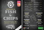
 
I get the logic - but not really needed for a 2-sided flyer.

Call of Action is really to get people to the chipper or to hire the van out - and it's presented neatly - easy to read - easy to understand - and it has a bit of attention-grabbing in the design elements.

I throw so many flyers in the bin on a daily basis - but I keep the nice ones. I like the flyers where people put the effort in and has some punch.
 
I’m not saying put the map on the front.

You just need to list the four locations. People looking at the flyer will see the name of their village.

Even better, have a flyer for each village. That way if left in pubs and shops it has a more immediate effect.
 
Hi everyone & thanks for the last round of input.

I have run out of ideas & I'm keen to get these printed so this is the last draft.
Thank you so much for all the help.

Ben

a5double_finalwebmap.jpg
 
Hi everyone & thanks for the last round of input.

I have run out of ideas & I'm keen to get these printed so this is the last draft.
Thank you so much for all the help.

Ben

View attachment 7343
I just hope that I'm not right about the edge of text being cut off. I appreciate you might not want to amend it but it would be a shame for graphics/text to be cut off for the sake of minor adjustments.
 
Text around the map on the back side seems too big compared with the rest of the layout imo.

Your prices don't line up on the right side, they need to be lined up. Think left align for text, right align for numbers.

Check the dots between the items and the prices, some have a space before and after the dots, chips (and maybe others) doesn't... consistency

Just embrace my 'curiosity' here.... can you try putting the pink fish and chip awards on the left, and then right aligning the company branding.... Could you also try just switching sides on the pink award thing to. Something just isn't sitting right for me with it being how it is but can't quite put my finger on what it is.
 
Don't know why you took out that lovely infographic you had for the map!

It doesn't look engaging as it did before!

Still looks good - if that's the final draft then I'd say go for it.
 
Back
Top