Flyer Leaflet Design

Benchelt

New Member
Hi there

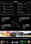
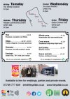
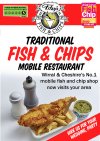
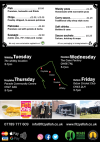
I'm struggling with the attached design. I'm reasonably happy with the front but I cant work out how best to display the photos and the content on the back.
I'm guessing it should have more of a nautical theme but, I cant think what to change or add.

Any help would be greatly appreciated & many thanks in advance.

Ben
 

Attachments

  • a5double_front.jpg
    a5double_front.jpg
    56.8 KB · Views: 28
  • a5double_back.jpg
    a5double_back.jpg
    63.4 KB · Views: 29
How are you going to distribute the flyer?

It is for people outside the local area who don't know about your fish and chips?

The reason I ask is you probably need to focus on the mobile bit more than the traditional bit. And put the map/timetable on the front not the back.
 
Hi there,

Thanks for all the input. I have to agree that the font change had a great impact. I have changed the photos layout which looks better now.
People do not always realise we are mobile which is why the photos are so important.

I removed the quote which gave me space for the more important info & simplified the contact content.

Any more feedback would be great thanks.
 

Attachments

  • a5double_front.png
    a5double_front.png
    56.1 KB · Views: 9
  • a5double_back.png
    a5double_back.png
    45 KB · Views: 10
Hi there,

Thanks for all the input. I have to agree that the font change had a great impact. I have changed the photos layout which looks better now.
People do not always realise we are mobile which is why the photos are so important.

I removed the quote which gave me space for the more important info & simplified the contact content.

Any more feedback would be great thanks.
Just a quick question...are you sure you want to use so much black? Cost wise and in my opinion/experience there can be issues with legibility when there's so much black and relatively thin fonts.
 
Definitely with litho print you get that fill in effect with thin fonts and lines, due to the plates and emulsion etc. dot gain, dry plates, corrosion issues and lots of things can go wrong with a plate, dampening solution, blanket washes, blanket pressure - there's a lot to it.

Not so much an issue in digital - but it depends on the digital printer.

You would definitely want to go at least a demi/semi/bold version of the font and increase the tracking a little bit to separate the lettering so they are not touching each other.

Some issues are covered here very well https://www.prepressure.com/design/basics/reversed-type


Anyway - you would get great effect by using white background for the menu area - would be a very nice contrast and showcase the menu.
So white background and black text for the menu area only.


I'm still not mad on the font and looks bleak on the front.

Maybe use green on the front as well. Personally, I'd go with red.
 
Thanks to everyone for their help with this.
We will be printing 20,000 so, the design needed to be better than it was.
Attached are the final designs based on the feedback I received.

Cheers,

Ben
 

Attachments

  • a5double_front.png
    a5double_front.png
    60.5 KB · Views: 18
  • a5double_back.png
    a5double_back.png
    44.3 KB · Views: 17
Sorry, came late to this, but where's the nice big photo of some mouth-watering fish and chips on the front?!

The little photo on the back looks like half the chips have been eaten. Design, could do a lot better.
 
I have to agree its not feeling like a Fish and Chip flyer I know your brand colour is black. Maybe try changing the photo on the front to a nice pic of fish and chips.
 
Honestly... that really doesn't work for me either and imo is a waste of 20,000 flyers because as someone who likes fish and chips, that doesn't make me 'want' fish and chips from you.

Just a little question... why have you put more emphasis on the queues outside your van than you have the product you're selling in the main image on the front? Nobody wants to stand in queues...
 
Attached are the final designs based on the feedback I received.
Nooooooooo!

Still so many things wrong with those flyers.

Everyone who already knows you doesn't need a flyer.

Those who have heard of you but don't like fish and chips don't need a flyer.

Those who don't have a clue need to know you are coming to their village every Friday at 6.30. That's what needs to be on the flyer.

You need a promote the mobile bit and the locations and put this on the front on a WHITE background!

As already said, 20,000 flyers will go in the bin if you get these printed as they are.
 
Hi everyone & thanks for the last round of advice.
This is where I am now. What do you think?
 

Attachments

  • front_new01.jpg
    front_new01.jpg
    59 KB · Views: 13
  • back_new01.jpg
    back_new01.jpg
    69.1 KB · Views: 14
I'm not a fan of the wishy washy grey and it's just lacking some 'soul' if you get me.

The front font choice doesn't work for me either and if I'm being honest (missed this last time) that 'No 1 mobile fish and chip shop bit' means sod all to most people because for all we know you might be the only one.
 
Put the locations on the front! In fact, put everything on the front. Don’t have a back.

Use a white background.
 
Hi everyone & thanks for the last round of advice.
This is where I am now. What do you think?

It's getting closer. But you need to change everything!

Get the official mastercard brand and contactless icons


The grey isn't working

Look at this - https://www.istockphoto.com/ie/vector/fish-and-chips-menu-template-gm1041213422-278756566
Fish and Chips on a blackboard - something you'll likely see at the stop right?

The image on the front doesn't look appealing - you'd need some photoshop magic to bring that to life -

The map on the back isn't working - it's too sterile

Look at all the beautiful ways you tell people about the locations.
You could easily recreate this and lose the icons and put in information

The food menu is unappealing and BORING!

Look at the all the great ways you can present fast food


Put the locations on the front! In fact, put everything on the front. Don’t have a back.

Use a white background.

No - don't do this.
 
Hank beat me to it, but...

Apologies, I just did this quickly to save a lot of explanation, and it's very rough. Get some colour in there. I know it's your 'brand', but black and
white isn't great for a flyer, needs to be more punchy. Get a photo of the van on the front, with the fish and chips smaller?

Get a better photo of your lovely van without the two builders having a can of beer! I had to hunt for it on your website. The site design seems going for
a premier feel, but the photography lets it down - you can't have black and white photos of the food. Get a nice wedding photo in there or something if
you're going for upmarket.
 

Attachments

  • poster.jpg
    poster.jpg
    445.7 KB · Views: 9
The only thing I would ever check on a flyer for fish n chips is where you are and the times you open. I'm not looking at what payment methods you offer or even prices - generally fish n chips is not that expensive.

I don't think you need to put on as much information as you are doing - keep it simple. I don't want to see three blokes holding an award. Yeah put the award logo on there (implies a level of quality of the fish n chips) but not the other two pics next to it.
 
The fact that there's going to be 20,000 of these printed is what is, I imagine, keeping people hanging in there and trying to get the best out of this.

Keep going, you're moving in the right direction - think outside the box - and pull it all together into something amazing.

I get lots of flyer drops through my door - 99% are terrible and go straight to the bin.

Think of your target audiences. It needs to scream "We're coming and you need us!"
 
Back
Top