Florist logo / identity

SMabille

New Member
Hi,

My partner is setting up a florist in our local (but massive farm shop/garden center complex). The building is sage colored wood building (think oversize garden shed).
So her brief was: "something classic, classy, that fits with the building and surroundings but with a modern edge (as she wants to specialize in modern flower design)"
I came with 2 design and her with one. We are not design professional so any critic and/or advise will be more than welcome, otherwise just let me know which one you prefer.

Thanks,
Stephane

gabriel.jpg
GBLogo2.jpg
kevlar.jpg
 
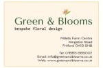
One and two are the nicest, and one's the more modern-looking; one thing I'd say about all of them, though, is that the connection between the lowercase 'l' and the floral graphic isn't all it might be - I see what you're aiming at but I'm not sure you're quite pulling it off.
 
I agree, number one is the strongest, but I also noticed the floral detail doesn't tie into the text. I'd try setting the text in a dark shade of green rather than black, and then using that same shade in the floral detail. It could just be me, but the detail looks like it was taken from somewhere else? If this is the case, you should get rid of it and create something similar to avoid problems with copyright if you wish to trademark the design. Also, the end of the s appears to be cut off in the first image.
 
I don't particularly like any of the fonts, i'm sure you can find a font that compliments your florist garden complex better. Although after reading your post, I kind of like what you have done with number two; I like that roughness 'sheddy' feel that you created with the text and then having a complete modern contrast with the floral detail. I really like that idea, it's kind of like a nice combination of sweet and sour :) And as an idea I think it could work well, as it is different but still needs some more work and pulling together and again a different type of font.
 
Well personaly I like number 2, you may want to darken the font a little on this one to make it more visable but i think it may suit your brand more than the others.
 
Hi,

The detail was indeed taken from somewhere else, just downloaded a temporary snapshot of a for sale logo. Now that we are sure that we are going to use it I bought the relevant license and AI file :)
 
For me I prefer the 3rd one although I don't really like any of the fonts used, maybe play around with different fonts..
 
Back
Top