Floodlight - Logo Critique

G.A

Member
Hi guys, today I want to present a new concept development for a project I've been considering. Given the criticism I've received about my past work, I hope I've caught it in the most constructive way. Let's take a look together!

Floodlight is a consulting firm that helps small businesses & entrepreneurs truly understand their online marketing efforts and generate effective strategies to help grow their business.

Their name identifies the main premaise, which is to bring clarity to their clients: to bring light, uncover things otherwise hidden, thus becoming more confident moving forward into the dark with powerful awareness.

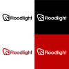
In my concept I wanted to stick to this idea: the power of the flash of light that allows you to see your way forward conscientiously.

1615896752713_Artboard 1.png
1615896762322_Artboard 2.png

I used negative space precisely to try to give greater depth, with its bold thickness to emphasize its power.


I'd like to get your opinion about it!
 
What’s the meaning of the seashell?

A floodlight is not a flash of light.

Not even sure I understand what the company does either.
 
What’s the meaning of the seashell?

A floodlight is not a flash of light.

Not even sure I understand what the company does either.
The company does business consultancies.
What aspect brings you back to the seashell?

The light is not composed of a single direction but of several rays, and it's for this reasons that I wanted to represent this beam of light in this way, that goes deep to illuminate
 
Biggest issue is the 'floodlight' doesn't look like a floodlight....
What a floodlight should look like?

I tried to differentiate in an abstract way also because the "light's rays" are very iconic and common, but surely I can try to achieve another solution
 
Which direction do you suggest?
A different direction.

It's up to you to come up with the solutions.

We can't design it for you. Research floodlights and draw inspiration from them -that's why i did the google search.

It can be a heck of a lot simpler and a lot more recognisable.
 
I was thinking shuttle cock or foot.

Even if you push it towards lighting it's more like a stage light or spot light but even that would be a stretch.
That's what I was thinking - the beam has to be wider than 45 degrees (spotlight angles) to be a floodlight which are usually above 120 degrees of light.
 
Okay got it, I keep working on it! Thank you as always guys
As well as that - check the space in the lower case g - as the descender is extremely close the to the counter.
The gap minimum for screen printing something is .12mm in the postive, and .10mm in the negative (think balloons, or t-shirts, or other screen printing requirements).
Looks like that lower case g could cause issues at print under certain circumstances.
Oh, thank you hank. Very useful tip. I knew that I needed to adjust a little bit the proportion of the type with the mark, but not in this way.

Anyway, for tips like these, about the typography and other technical adjustments, can you suggest me some books?
 
The company does business consultancies.
What aspect brings you back to the seashell?

The light is not composed of a single direction but of several rays, and it's for this reasons that I wanted to represent this beam of light in this way,
The Duck’s foot looks like a seashell.

A floodlight is not several rays.
 
Oh, thank you hank. Very useful tip. I knew that I needed to adjust a little bit the proportion of the type with the mark, but not in this way.

Anyway, for tips like these, about the typography and other technical adjustments, can you suggest me some books?
I haven't learned anything from books.
 
Back
Top