Hi guys
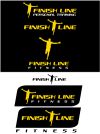
Im a personal trainer and Im designing a new logo for my business. As yet I haven't settled on Finish Line Fitness or Finish Line Personal Training and at this stage Im playing around with some ideas.
Im happy with the runner vector and the font type and I want to retain the gold/black/white colour scheme. Im struggling a little bit with the layout, colour contrast and scaling/positioning between lettering and runner.
The majority of branding will be used on a black background (website, leaflets, tshirts, livery etc) however I want the logo to work just as well in grayscale or on a white background for letterheads etc.
I would appreciate any advice or suggestions you experts can offer on what I've scamped so far!
Thanks in advance!