Fish & Chip shop Re-brand.

ARRIVALS

Well-Known Member
Evening all.

I've been working on a new logo for a local fish and chip shop in Blackpool. A pretty old one, but they're becoming a little more up market - as fish and chip shops go. A new restaurant is being fitted so they've decided to rebrand.

What are your thoughts on this? I'm trying to stay away from standard fish and chip shop identities, the naff looking ones. Every town has them! Anyway, this is where I'm at and not sure where to go now.

Hit me!

Cheers.
 

Attachments

  • Joyces1.jpg
    Joyces1.jpg
    94.8 KB · Views: 62
  • Joyces2.jpg
    Joyces2.jpg
    33 KB · Views: 62
It's quite nice. I'd have a look at the kerning though, and lose the dot dividing the lines of text.
 
Thanks for the replies.

The dot was annoying me. I wanted some way to separate the 2 lines of text, but looking at it, I'm not even sure I want the 2nd line. If you see the image on the sign above the store and smell whats inside, it's pretty obvious its a fish and chip shop.

Joyces1.jpg
 
Place look like they've been run over!! lol...... back on topic...

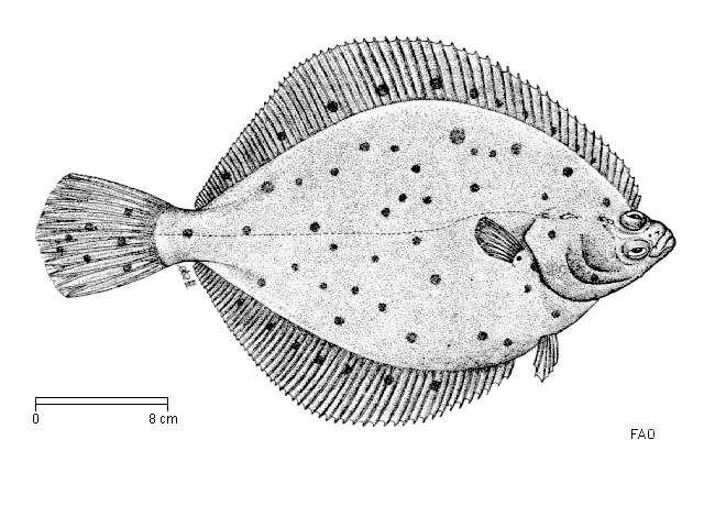
I like the artwork and I know a plaice is a place and they all look the same and the illustration needs to look like a plaice, but I'd worry how close the illustration is to this google image:

plaice.gif
 
You're right Dave. Infact that's the image I drew round. And that was my reasoning too. 99% of plaice look exactly the same so figured I'd just pick one to draw round. I actually thought that was a grey-scaled photo, but actually its an illustration isn't it? Assuming I just drew round a photo of a plaice, do you think I'd have issues with copyright? Not quite sure how I'd make my plaice look different to every other photo/drawing. I'm not a plaice expert!

Any advice about this would be pretty handy.
 
Rather than tracing the fish, you could use the image as a reference and draw your own? That way it'll look enough like a plaice to tell what it is but not so much that it looks copied. Alternatively, as the shape of the fish is unlikely to change, you could keep the illustration you've got and lose some of the 'features' of that particular fish (ie; face details, gills, spots etc..) and re-draw those yourself?
 
It was my aim to make it literal. I don't want to use a cartoon or comical looking fish, a-la most other fish and chip shop logos. They fit well for those high street fish and chip takeaways. This particular one is a more up market one, and more of a fish and chip restaurant than a take away, hence the more contemporary looking logo. So that being said, I thought I'd take a different route by actually using a real fish, and making it more graphically nice to look at.

The name Joyce's Plaice is a pretty cool name and a great play on words, so I want to make use of it.

Cheers for the feedback everyone. And Kate, perhaps that's what it's missing - a smile!
 
I like the concept of it being a more 'classy' image rather than the standard cartoony type fish you normally get with chippies. But definitely agree that it could do with simplifying. I was bored an mucking around so I slightly simplified your version, I also drew a very quick (and a bit shite) version as well and I think it definitely could work as a cleanly drawn, more simple vector. (And yeh I know the finns and tails should have lines & I haven't drawn the gills but I couldn't be arsed :icon_biggrin:)

nci36h.jpg
 
Back
Top