First time logo design - Feedback appreciated

TomWShelton

New Member
Hello everyone

First of all, this is a great forum and I'm glad I stumbled upon it. I would be thankful if some of you more experienced designers out there could give me some feedback on a logo I'm designing.

I'm part of a singing group called 'Filey Amateur Showgroup'. They've never had a logo or anything before so I'm taking upon myself to change this. Filey is a small, seaside town and I wanted to reflect this in the logo design. One of the main problems I've encountered is that the name of the group itself is very long and hard to incorporate.

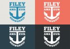
Anyway, after months of scribbling on pad, researching ideas and messing around in Inkscape, I finally came up with this:

Filey Website Anchor Logo V6.png

The colours I've chosen aren't final but I quite like the nautical scheme. The logo, however, does lend itself to many variations:
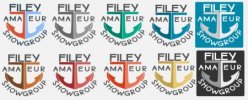
Choose-your-logo.jpg

What are your thoughts on the overall design? I don't know if it would benefit from being on some sort of background, within a vintage badge design or whether to leave as is.

Thanks in advance for any comments

Tom Shelton
 
concept is nice. Not too keen on the execution. Typeface perhaps needs changing. The 'SHOWGROUP' at the bottom could fit in between the anchor prongs. Colours also need work, I like the greens in the multi logo example.
 
concept is nice. Not too keen on the execution. Typeface perhaps needs changing. The 'SHOWGROUP' at the bottom could fit in between the anchor prongs. Colours also need work, I like the greens in the multi logo example.

Thanks for the reply jooty and I certainly agree with your comment re: "SHOWGROUP" - I hadn't noticed that until you said it and now it's driving me crazy. Hoping to have another go at it later. What kind of typeface would you suggest?
 
oh and also give it a go with the anchor as one element with a single colour rather than split. Generally work in black and white, well personally i work in a very dark grey like #383838 then when you are happy with the structure and feel start injecting the colour
 
Hi all,

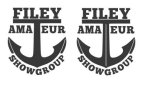
I've had another quick go at the logo tonight with jooty's comments in mind. What do you think? An improvement? More to be done?

LogoV2.jpg
I played around with trying to make the "AMA" and "EUR" smaller to fit under the horizontal bar but then the logo looked a bit unbalanced. They're aligned to the anchor points now but could maybe come in a little.

Thanks

Tom
 
Hi all,

I've had another quick go at the logo tonight with jooty's comments in mind. What do you think? An improvement? More to be done?

View attachment 2147
I played around with trying to make the "AMA" and "EUR" smaller to fit under the horizontal bar but then the logo looked a bit unbalanced. They're aligned to the anchor points now but could maybe come in a little.

Thanks

Tom

This version is much, much better. Great to see you are taking comments on board and striving to improve it.
 
This version is much, much better. Great to see you are taking comments on board and striving to improve it.

Thanks Corrosive. I'm always open to ideas and suggestions, it's just whether I have the skill to implement them :icon_wink:

I've done a couple of colour trails as seen below. Any feedback on this and the overall design are still very much welcome.

logov6.jpglogov7.jpg

Thanks

Tom
 
looking great Tom, not too keen on the black outline on the anchor, but thats just me.

Hi jooty - I thought that myself as soon as I uploaded it and plan to remove the black outline later. :icon_wink:

When it comes to Facebook/Twitter profile pictures - I'm wondering whether to just base this around the letter "F" so it's clearer than the full logo?

Thanks

Tom
 
Here's the corrected logo without the black line around the anchor. All I need to decide now is which scheme would look better on a website. Decisions, decisions....

FAS Anchor Logo Blue.jpgFAS Anchor Logo BlueGrey.jpg

I find it amazing when looking back at the logo I posted at the beginning of this thread and seeing how just a few small changes have made such a big difference.

Thanks

Tom
 
This is good now... just to be nit-picky can you try with FILEY slightly higher above the anchor - maybe even the spaces a bit?

Well done!
 
Back
Top