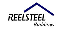
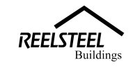
First attempt at a Logo - perhaps more experienced users can advise.

batman

New Member
My first attempt at company logo design.

would like some feedback, I'm thinking something is missing, or something is not right.

I have used a basic Helvetica font for the logo, perhaps I will also try some other fonts.

Any suggestions / advice by more experienced designers on improving most welcome.

The buildings text is FONT Iskoola Pota
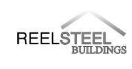
logo 2.jpg :thumb:
 
There is a little too much going on font-wise for me. The word 'steel' looks like a different font to 'Reel' because of the stroke rounding off the edges so it feels like three fonts... Which is way too much! Also not keen on the way the gradient because the roof pretty much disappears at the top. I'm no graphic designer (as other members here will testify) but perhaps start in black and white/sketch form, make sure it works like that and then render some colour if needs be.
 
Lose the strokes and the gradients for starters, and just work in black and white solid colour like Corrosive says until the design 'works'.
 
okay have tried to take the advice best onboard.

have stripped everything back down, re-made the custom shape "ROOF" tried everything just plain BLACK and WHITE

now have been messing around with a few fonts too.

blending options, shadow, overlay dark blue on the roof shape (or is this too much) ?

I think this is a vast improvement, what do you think?

not sure about the 2nd buildings FONT (as it may look a little bit too much like comic sans (which is a no no in Graphic Design I have learned that much haha)

also do you think the main font is an improvement?

version 2.jpg
 
Last edited:
I wouldn't mix serif faces with sans serif ones. I'd suggest sticking to a sans serif for this, serifs are typically used for products or services with 'elegance'.
 
are there any fonts in particular you could recommend trying for the "Buildings" part? I will see if I can draft up another try.

thanks this forum is great for learning do's and don'ts! :icon_cheers:
 
If you used Helvetica in a heavy weight like in the first one then I'd just opt for a lighter weight, maybe even an italic.

Off the top of my head I'm not sure what to suggest for the font you're using at the moment.
 
...then I'd just opt for a lighter weight, maybe even an italic.

I'd be wary of mixing regular and itallic type, especially if you're sticking with the roof device; I think you can see in Logo4 that the angles in the pitched roof, combined with mix of upright and itallic characters has a negative impact on the 'coherence' of the overall piece. Regular and italic can work nicely together but I'd avoid it here, m'self. I'd also argue that rigid, upright characters would be a better fit with the concept of construction.
 
yea - for example the DeWALT logo on drills etc is quite a heavy font for this kind of industry. I see where your coming from now. I will see what I can come up with.
 
The DeWALT font (if memory serves) is quite a heavy-duty, brutal looking thing though and Reelsteel might require something a bit more elegant - all depends on what they do, really: supplying to the trade is one thing but selling direct to the domestic/residential market probably wouldn't be well served by an image that speaks of hard hats and steel toecaps.
 
I'd agree about not mixing serif and sans serif, I'd change 'buildings' to sans serif.

Not convinced that buildings should extend out beyond the upper wording? What does everyone else think about that? For the second font, I'd like to see the same font as the upper word, but in grey.
 
Back
Top