Nb1299
New Member
Hey guys,
I’m trying my hand at designing movie posters. I need some feedback to know how to improve!
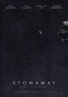
I started my design with the first version. I liked the concept of having a vast space scene but felt that the outcome was quite static and dull, not really engaging the viewer as much as I’d hoped.
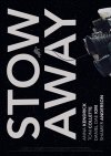
So I developed it into a bolder style and I think the composition itself works, however I’m not sure if it looks professional enough and if it’s suitable for a film poster. I’m happier with this style as it’s more attention-grabbing and feels more modern, but I’m not sure it’s there yet. Does the vertical placement of the copy work? How can I improve it and make it more appealing to an audience?
Any feedback would be so helpful and greatly appreciated!
Thank you and have a great day")
I’m trying my hand at designing movie posters. I need some feedback to know how to improve!
I started my design with the first version. I liked the concept of having a vast space scene but felt that the outcome was quite static and dull, not really engaging the viewer as much as I’d hoped.
So I developed it into a bolder style and I think the composition itself works, however I’m not sure if it looks professional enough and if it’s suitable for a film poster. I’m happier with this style as it’s more attention-grabbing and feels more modern, but I’m not sure it’s there yet. Does the vertical placement of the copy work? How can I improve it and make it more appealing to an audience?
Any feedback would be so helpful and greatly appreciated!
Thank you and have a great day