Festival Poster

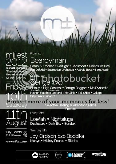
A draft of a poster for a new music festival.
The text layout etc will most likely change a bit as well as a few other things but just wanted to see what people thought of it as a whole.
The logo is my doings as well.

posterdraft-1.jpg


Colours look slightly different brighter than the photoshop file aswell for some reason.
 
Why is it upside down is my first observation and second I would try to get the circular logo completely on the darker background of the grass so that it is clear enough I don't think the lower section sits quite right where it comes into contact with the blues/whites of the sky.

The word Friday is difficult to read.

You also mention its a photoshop image, has this been finished in illustrator or in design for the text?
 
yeah for the text I have used illustrator.
cheers for the feedback, all things noted. probably going to flip the background the right way up as well as im not sure it works any more.
 
It could work with a better image, it's almost black at the top on my screen. I would introduce some colour or more interest at the top. Make the logo more interesting.
It all looks a tad bland.
 
flip the img / friday is hard 2 read also add some more colour to it, its a poster for a festival it could cry out colour and music what type of festival is it(music wise i mean)
 
its an electronic music festival. i was using the background image for the summery festival feel but it doesnt really cry out the genre..
 
Here is a newer draft:
Again, I don't know why when I upload it onto the web the colours look so much more intense that they do on photoshop/preview or when I print out a test
Any help as to why would also be appreciated. Because when it goes on facebook for example I want it to look right.

draft1.jpg
 
Its an improvement on the first design, but still does not capture the essence of a music festival.
You mention its going on a Facebook page so they may well still be some issues with the legibility of the text. Notably in the section headed Benga, the wording under Netsky and High contrast.
Little unsure as to what the design is at the top of the poster?
 
I'm guessing the colour change is due to the difference in colourspace. Are you working in CMYK? Once uploaded it will be displayed in RGB (screen). It tends to ratchet up the luminosity. If the final artwork is going to be used for screen, try converting a file to RGB from the original artwork and seeing how it uploads.

As for the design. It has a festival feel. Perhaps it's still a little too laid back for dance music, but I like the attempt at the top to introduce a more modern looking design element. Almost looks like a star chart or something. Perhaps the top of the poster could begin as a night sky and fade into day as it gets to the grass? If it's a night time festival, that is.
A agree with the legibility comment above too. Consider what the end use is and design the layout with that firmly in mind. For example you might have a slightly different layout for a printed poster than one going up on facebook.

Hope this helps.
 
Had another change around after some feedback from the agents etc.
Feedback much appreciated..

draft2-1.jpg


Thanks for the colour format help as well! Sorted out the problem.
 
It's a bit more legible, perhaps it's worth looking at the text beneath 'mifest' seems a little squeezed. The 'selective hearing...' lines look a bit strange to me being centre justified amongst a block of text that is left justified.
I'd also be concerned about losing the top logo a little, by making it transparent. I'd make that opaque and think of a good way to make it sit up there with some more impact.

I think the problem of it not quite reflecting the type of music being played is still present, but I'm guessing the client hasn't got a problem with it?
Also is there a logo missing from the bottom left as it looks like a blank space and the other logos are all skewed to the right?

Yes, there is another logo waiting to be added to the left of the bottom logos which will fill the gap.
Thanks for the feedback. Would you say its definitely an improvement on the earlier versions? minus the points you mentioned
 
I think it has come along. Each revision has been an improvement.
A little more time spent tightening up the typography will push it further. I might suggest using a bit of colour in the text to help with the hierarchy. At the moment it's difficult to assess which pieces of information should be the most important.
 
Its getting there, i agree with the comments made by Ken. Could reflect the genre of music a lot more.

In my opinion i much prefer the way the text is laid out in your 2nd design you have posted, your latest design i find the layout of the copy does not sit right.

And would try to find an image of the sky that isn't so overcast, something more sunny more blue sky possibly with a lens flare make it a little more creative and definitely a lot more appealing.
 
Back
Top