Feedback Required

Creo

New Member
Hi All,

I've been doing design for the last year (though dabbled for a long time before that in illustration).

I've been working on a logo and am failing to please the client. I wanted to get some feedback and appreciate your comments.

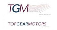
The logo is for a mechanic/garage. Below in the middle (red) is the old one. The left and right are new versions. Feedback appreciated.
Screen shot 2012-03-27 at 11.26.45.jpgScreen shot 2012-03-27 at 11.27.09.jpgScreen shot 2012-03-27 at 11.28.15.png
 
The first one doesn't seem to mean anything at all, it says nothing about a mechanic or a garage to me. It's just generic with a font that also doesn't seem to say mechanic to me, either.

Without wanting to sound too critical, I really don't like the one on the right either. I don't like the font (says garage/cars to me more than the first but still not for me). Think the car drawing could have some legs, but certainly not both of them and not set out on top either.
 
There's definitely more work to be done with them I'm afraid.

There are so many different avenues you could explore with the mechanic/garage approach, I'm surprised you've went for something as generic as this?
 
Well its a bit harsh but I appreciate honesty. The first TGM was the one I liked but the second was more based on the feedback I got but going against what I like. I find this one difficult because I don't think I identify well with more masculine subject matters (i.e. mechanics) - BUT I want to get this right.

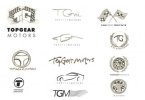
Here are some further sketches I've done. I'd appreciate any feedback. Again there has been a request from the client for things like checkered flags, car silhouettes and the racing crest.

Screen shot 2012-03-28 at 10.10.49.jpg
 
It sounds to me like the client hasn't given you much of a brief.
Their original logo - looks like a tyre sales outlet but has a name for a racy sports car garage.

I would recommend you talk to them and ask searching questions about their core market - and who do they want to attract?

Could be reliable family / price sensitive or tuning specialists for the young boy racers.

In other words they need to brief you so you have a clear direction to go in. Your further sketches are actually better and show promise but are very wide ranging and you could use these as examples of the effect on their customers of different image directions. They need to decide what company image to project and then you can reflect that. So, go talk to them.
 
Well its a bit harsh but I appreciate honesty. The first TGM was the one I liked but the second was more based on the feedback I got but going against what I like. I find this one difficult because I don't think I identify well with more masculine subject matters (i.e. mechanics) - BUT I want to get this right.

Here are some further sketches I've done. I'd appreciate any feedback. Again there has been a request from the client for things like checkered flags, car silhouettes and the racing crest.

View attachment 1321

I really like a lot of your sketches though; think there is potentially quite a few really good logos in there but I just think you've picked a couple of poor ones initially!

As the reply above says, I think if you find out some more about where they're looking to go with it and what sort of image they're looking to convey then that might be able to help you, particular with such a contrast between what they have currently and where you seem to be looking at taking it. That guidance will only help.

I think there is plenty to work with in your sketches though.
 
Back
Top