Feedback PLEASE

Noel Modyrts

New Member
I've been commissioned to design a logo for a dance music event. The client is pleased, but has apparently been told that the logo bears too much resemblence to the (now "old") pepsi logo....

What would you say / recommend? Please comment
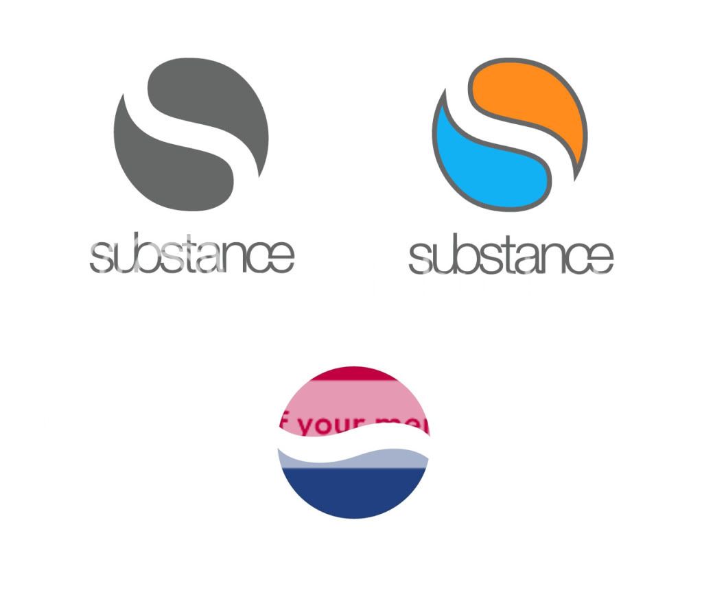
logo1.jpg
 
I would say i agree with whoever said it's similar to the pepsi logo, and yes, as above, also the yin yang symbol. I would try and take the shape and form further to remove it from the resemblance to these existing shapes into something more developed.

There are some interesting shapes created in the negative space of the typeface you use - perhaps use those as a starting point?
 
Even, just putting a stroked outline a cm outside the whole image could move it away from the pepsi look.

It might look too badge like then though. Hmmm could be worth showing as one of your samples to her?
 
Back
Top