You are using an out of date browser. It may not display this or other websites correctly.
You should upgrade or use an alternative browser.
You should upgrade or use an alternative browser.
Feedback on my taxi app screen designs
- Thread starter wilmasafe
- Start date
Paul Murray
Ultimate Member
Overall I like it so far. The yellow reminds me of Yell/Yellow Pages though. is that intentional, or is it a reference to New York cabs?
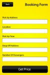
I'd suggest is perhaps making the input fields slightly taller to give more space for data input. They feel quite small, and an iPhone screen isn't particularly big.
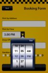
Can you have radio buttons ("1, 2, 3, 4+" maybe) to select the number of passengers, rather than requiring a user to click and type? This will make it quicker and simpler. Can the pick-up time be a digital clock that you use to set the time? Also, what's the difference between the pick up address and the location? It's not obvious to me.
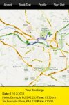
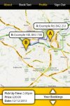
Finally, you could probably make more use of the screen space on the map screen. Maybe the addresses pop up on the map at the pin points, rather than just at the bottom? This will give you more space to have estimated journey time, price, ETA. Maybe these are displayed on the map too? Maybe users have a choice between a 'map view' and a 'list view' of their booking?
DigitalYak
Member
I like the layout and the overall design of the app, I do agree with Paul that your choice of yellow does look a little like yell, I know you can associate yellow with taxi's but maybe a different shade would help causing confusion, other than that it looks good.
jooty
Active Member
Really great app design. Good stuff. How about giong the route of things like the linkedin app and the twitter sign up home screen, what a bout a nicely retouched photo of a taxi driver from the customers pov, you know like your looking at him through the window. Done right it could look ace.
