jack.burdess
New Member
Hello everyone 
I've only just became a member! I'm not studying graphic design, i'm studying Product design. However, For our final exhibition that is coming up, we have been asked to design 4 A2 posters for each project. They will have the titles:
Discover - What is the design problem? Client?
Define - what you will be designing
Develop - sketches/ initial ideas
Deliver - final design
I'm currently working on 4 A2 boards for a Styling Chair i designed for Hair Salon use, for a furniture company aiming to break into this market.
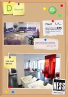
I wanted to come up with quite a quirky, rough design for the boards. Here is the first board. Its only a draft so it will be done in better quality. Any advice would be great thanks
