You are using an out of date browser. It may not display this or other websites correctly.
You should upgrade or use an alternative browser.
You should upgrade or use an alternative browser.
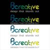
Feedback on my new logo please...
- Thread starter philjohns
- Start date


berry
Active Member
love the p& j graphic. hate the rest! too arty
I would suggest to develop the pj graphic as a stand alone logo, maybe closing the gaps a bit more.
and then simply using pj creative as a namestyle in a 'classic' font. I would alway suggest to designers ditch taglines, you're overselling the obvious and generally trite. K.I.S.S Keep It Simple Stupid! as they say. You have something, but you've overcooked it and added too many ingredients. half way there in m y opinion
philjohns
Senior Member
Thanks Berry - really useful advise!
Do you mean try with just the PJ graphic and then creative in a normal font or the PJ graphic and then PJcreative in a normal font below or wherever?
Also, what are views on having the styled colour to it? Its something Ide really like to base my branding on so would appreciate some views on that.
Thanks again!

berry
Active Member
philjohns said:Thanks Berry - really useful advise!
Do you mean try with just the PJ graphic and then creative in a normal font or the PJ graphic and then PJcreative in a normal font below or wherever?
Also, what are views on having the styled colour to it? Its something Ide really like to base my branding on so would appreciate some views on that.
Thanks again!
something more like this..ish.....
Attachments


berry
Active Member
looking interesting, i prefer keeping the pj in the namestyle, that means the logo can be a brand icon graphic and have more visuality like the original blue. Also it means we don't have to decipher the graphic to get to your name. But there is a nice simplicity to the graphic and i love the organic shape it produces. Just make sure the balance of the font doesn't fight with the graphic, Ying and Yang, Hot and Cold, Beef and Mustard

berry
Active Member
Phil,
if you check out all great brands there is a very simplistic approach to them "Apple' Shell, Nike ,IBM, Orange, Vodaphone, Banks, Building societies etc etc. They generally stay away from trendy designer looking fonts because it will date. Serif fonts are easy on the eye to read, lowercase prefered. Look at the letter in the namestyle, you have a lot of consecutive round letters the c and the e are the defining shapes, look for fonts that have good letters. I prefer plain classic fonts as they give a bigger feel, Generall as a rule if i had a an organic graphic like yours with a geometric straight and round feel I would balance it out with a serif font to create contrast. But I would experiment and have a bit of fun. It's all fine tuning now.
if you check out all great brands there is a very simplistic approach to them "Apple' Shell, Nike ,IBM, Orange, Vodaphone, Banks, Building societies etc etc. They generally stay away from trendy designer looking fonts because it will date. Serif fonts are easy on the eye to read, lowercase prefered. Look at the letter in the namestyle, you have a lot of consecutive round letters the c and the e are the defining shapes, look for fonts that have good letters. I prefer plain classic fonts as they give a bigger feel, Generall as a rule if i had a an organic graphic like yours with a geometric straight and round feel I would balance it out with a serif font to create contrast. But I would experiment and have a bit of fun. It's all fine tuning now.

VertigoSFX
Senior Member
Fifth one down...that's what I would pick.
VertigoSFX
Senior Member
As for the reason...well it is between either 1 or 5 because there is such a subtle difference between the two...the others are too bold for my taste...I like the simplicity of 1 and 5 how they are good sizes but aren't too thick...looking at it again I think 1 would be my favorite just because it is slightly larger and fits better with the logo itself.
