matt
Member
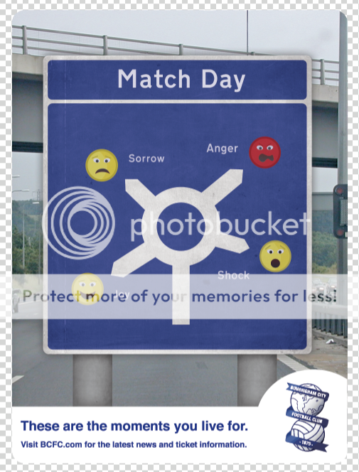
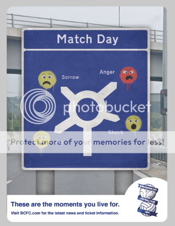
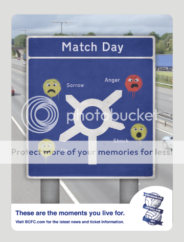
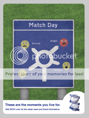
This new direction (the road sign) kind of makes the pitch in the background an arbitrary addition and correct me if I'm wrong, but the dimensions have been squeezed vertically to fit it in, no?
If you remove it entirely you could make the sign bigger and have more space to push the emotion theme. At the moment it seems quite stoic and flat; unemotional. A good match is a whirlwind of excitement and emotion all of which is entirely unpredictable; despite the nice textures and colours, the poster's not yet conveying that.
If you remove it entirely you could make the sign bigger and have more space to push the emotion theme. At the moment it seems quite stoic and flat; unemotional. A good match is a whirlwind of excitement and emotion all of which is entirely unpredictable; despite the nice textures and colours, the poster's not yet conveying that.