Feedback on a T-Shirt design for a homeschool group

jwilhite

New Member
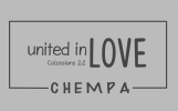
We are planning to print and sell t-shirts for our homeschool group (called CHEMPA), and I just wanted to get some honest design feedback from someone who knows more than me about graphic design. How could this be improved? It looks amateurish to me, but I don't really know how to express what's wrong with it or how to improve it. Ideas?
UnitedInLove.png
 
It's the font choice imo, it's not far off the meme font (comic sans) for designers.

With the style you're going for you need to be looking more towards a (I hate the term mind you) hipster font imo.

Your weighting of the words isn't really clear either, LOVE needs to be stronger and CHEMPA could maybe be a softer imo. Basically you might need to play around with the visual hierarchy a little.
That's so helpful. Thanks. Can you give me an example of a font that might be considered "hipster"?
 

I was thinking more along the lines of Icarus and Cast Iron rather than the more 'script' or 'brush' style options although mixing styles of fonts is always an option. You could use a script style font for 'love' while having the other words in a more sans serif type font for example.
 
Back
Top