Ooo – My first ever post here…
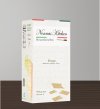
Aside from issues of typographical hierarchy and clarity (not to mention legibility), if you are going to name it Nonnas kitchen, it NEEDS an apostrophe. It is the kitchen belonging to your grandmother, therefore possessive, so should be ‘Nonna’s Kitchen’. However, if you want it to have an authentic Italian feel, why not ‘Cucina di Nonna’. As long as it is actually authentic, of course. If it is made by a bloke called Bob in Huddersfield, then using words like authentic Italian, will work against you.
Personally, I like the idea of using a box instead of yet more plastic wrapping, but I am afraid the design is a bit weak, obvious and predictable. Think about something that makes this product different. Why should someone pick it up, over any of its more established competitors? You need to find the reason why this is better. Vacuous, stereotypical graphic language won’t do it. The product itself needs to have a uniqueness, then it is your job as a designer to communicate this uniqueness. If that uniqueness is, for example, a recipe (as the name implies) that is original and just as someone’s Nan used to make, your visual language needs to reflect this. If, it is from a specific region, then use this as your hook. Each pasta is a different shape because it holds the flavour of the ‘sugo’ in a particular way. Maybe this is an avenue to go down.
See where I am going. ALWAYS start with an idea, rather than just ‘making pretty’. Design is about communication, not embellishment. If you have an idea, a reason, you have an avenue to travel down to find a solution. You may get to the end and find it was the wrong way, so change direction, but at least the solution will have substance.
Hope this helps and is not too disheartening. I always think honest criticism is more useful in the long term than feint praise.
Good luck.