You are using an out of date browser. It may not display this or other websites correctly.
You should upgrade or use an alternative browser.
You should upgrade or use an alternative browser.
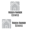
Feedback and Suggestions For Client's Logo
- Thread starter graphicdesign97
- Start date
- Status
- Not open for further replies.
graphicdesign97
New Member
can you please help me on how to fix it ?Honestly, it’s terrible. Awful typography. Clip art aesthetic. Entirely predicable kitchen table logo. The best was to fix that is to hire a professional designer.
Wardy
Well-Known Member
There's no hint of a hidden harbour, to start with.
It's very, very ordinary, to say the least. It's unbalanced and unimaginative and the font choice is very boring.
The problem you have is that harbours relate to boats mainly, or things like lighthouses. Do a bit of research on similar types of logos. If you're not an illustrator,
then don't do an illustration, keep it very simple.
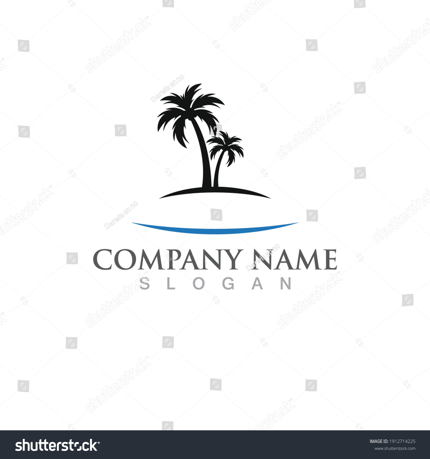
Well you've taken Stock Photography and actually made it worse
 www.shutterstock.com

 www.shutterstock.com

 www.123rf.com
And it's against their EULA
 www.shutterstock.com

Palm Coconut Tree Summer Logo Template Stock Vector (Royalty Free) 1912714225 | Shutterstock
Find Palm Coconut Tree Summer Logo Template stock images in HD and millions of other royalty-free stock photos, 3D objects, illustrations and vectors in the Shutterstock collection. Thousands of new, high-quality pictures added every day.

Palm tree summer template vector illustration
123RF - Millions of Creative Stock Photos, Vectors, Videos and Music Files For Your Inspiration and Projects.
And it's against their EULA
Shutterstock Terms of Service & License Agreements
The following is a legal agreement between you or the employer or other entity on whose behalf you are entering into this agreement and Shutterstock.
- RESTRICTIONS ON USE OF VISUAL CONTENT
YOU MAY NOT:
- Use Visual Content other than as expressly provided by the license you purchased with respect to such Visual Content.
- Portray any person depicted in Visual Content (a "Model") in a way that a reasonable person would find offensive, including but not limited to depicting a Model: a) in connection with pornography, "adult videos", adult entertainment venues, escort services, dating services, or the like; b) in connection with the advertisement or promotion of tobacco products; c) in a political context, such as the promotion, advertisement or endorsement of any party, candidate, or elected official, or in connection with any political policy or viewpoint; d) as suffering from, or medicating for, a physical or mental ailment; or e) engaging in immoral or criminal activities.
- Use any Visual Content in a pornographic, defamatory, or deceptive context, or in a manner that could be considered libelous, obscene, or illegal.
- Modify Visual Content designated "Editorial Use Only" in a manner that changes the context of what is depicted.
- Use Visual Content designated "Editorial Use Only" (including, but not limited to, Editorial content) for commercial purposes, including for reference, in any advertising, merchandise or other non-editorial contexts.
- Resell, redistribute, provide access to, share or transfer any Visual Content except as specifically provided herein. For example and not by way of limitation, the foregoing prohibits displaying Content as, or as part of, a "gallery" of content through which third parties may search and select from such content.
- Use Visual Content in a manner that infringes upon any third party's trademark or other intellectual property, or would give rise to a claim of deceptive advertising or unfair competition.
- Use any Visual Content (in whole or in part) as a trademark, service mark, logo, or other indication of origin, or as part thereof.
- Falsely represent, expressly or by way of reasonable implication, that any Visual Content was created by you or a person other than the copyright holder(s) of that Visual Content.
graphicdesign97
New Member
the company has nothing to do with boats or light houses, it is a real estate companyThere's no hint of a hidden harbour, to start with.
It's very, very ordinary, to say the least. It's unbalanced and unimaginative and the font choice is very boring.
The problem you have is that harbours relate to boats mainly, or things like lighthouses. Do a bit of research on similar types of logos. If you're not an illustrator,
then don't do an illustration, keep it very simple.
graphicdesign97
New Member
it was free for me to downloadWell you've taken Stock Photography and actually made it worse

Palm Coconut Tree Summer Logo Template Stock Vector (Royalty Free) 1912714225 | Shutterstock
Find Palm Coconut Tree Summer Logo Template stock images in HD and millions of other royalty-free stock photos, 3D objects, illustrations and vectors in the Shutterstock collection. Thousands of new, high-quality pictures added every day.www.shutterstock.com

Palm tree summer template vector illustration
123RF - Millions of Creative Stock Photos, Vectors, Videos and Music Files For Your Inspiration and Projects.www.123rf.com
And it's against their EULA
Shutterstock Terms of Service & License Agreements
The following is a legal agreement between you or the employer or other entity on whose behalf you are entering into this agreement and Shutterstock.www.shutterstock.com
Levi
Ultimate Member
And there is the problem... seriously you've just taken 'clipart' and stuck it together to make a logo.... there is no actual design put into it.it was free for me to download
Do you actually have any design background because this seriously makes it seem that you don't have any.
You know I'm seriously starting to think I should offer up branding/logo to clients if all it seems to take these days is sticking some clipart together.
graphicdesign97
New Member
never mind. how do i delete this thread.
sprout
Active Member
Don’t delete it. Dig deeper and find out why you got the reaction you did.never mind. how do i delete this thread.
People here are not horrible and are always ready to help with constructive criticism whenever it will help someone. However, I think we are all sick to death of people who have no qualifications, no experience and little ability call themselves designers because it is a cool career. Most of us have had a 3-4 year education, then the same again in agency experience before even thinking about taking on client work. Unqualified people setting themselves up as designers has become somewhat endemic in the industry.
It wouldn’t happen in any other profession. No one who was good at maths at school would ever think of setting themselves up as a chartered accountant, for example. Aside from anything else, it would be illegal.
If this is something you truly want to pursue, do it the right way. You will get a lot of help here if you want it.
Your original post just exposed your lack of understanding about what design is, I’m afraid. That’s not bad in itself. We all have to start, but right now you are not in a position to be taking on client work. You do them and yourself a disservice. Learn, but learn the right way.
Stick around. There are a lot of seasoned pros around here ready to help.
graphicdesign97
New Member
Thats what im asking. I am asking for help to get it betterDon’t delete it. Dig deeper and find out why you got the reaction you did.
People here are not horrible and are always ready to help with constructive criticism whenever it will help someone. However, I think we are all sick to death of people who have no qualifications, no experience and little ability call themselves designers because it is a cool career. Most of us have had a 3-4 year education, then the same again in agency experience before even thinking about taking on client work. Unqualified people setting themselves up as designers has become somewhat endemic in the industry.
It wouldn’t happen in any other profession. No one who was good at maths at school would ever think of setting themselves up as a chartered accountant, for example. Aside from anything else, it would be illegal.
If this is something you truly want to pursue, do it the right way. You will get a lot of help here if you want it.
Your original post just exposed your lack of understanding about what design is, I’m afraid. That’s not bad in itself. We all have to start, but right now you are not in a position to be taking on client work. You do them and yourself a disservice. Learn, but learn the right way.
Stick around. There are a lot of seasoned pros around here ready to help.
sprout
Active Member
There is no simple answer. You need to speak to your client understand who they are, who their market is, what makes them unique and communicate that to an intended audience. I am afraid, you need to start from scratch and come up with a solid idea that represents visually the tone of voice of your client. What you have produced is decoration – and at the risk of being too harsh – not all that pretty. I can’t just give you a step-by-step instructional. I don’t know your client. I don’t know their sector, their turnover, clientele, what they want to say and to whom, so it is impossible for me to do anything other than help you make it aesthetically more pleasant, but that would be completely missing the point of what a logo and brand is. I am afraid if you haven’t understood what this is, you need to get more experience in the field before taking on clients of your own.Thats what im asking. I am asking for help to get it better
I’d suggest applying all of the things I have said above. Go back to the drawing board and then come back with your next attempt. Also, give some more background about the company you are doing this for, so we can make some sort of useful critique.
Wardy
Well-Known Member
The logo needs to reflect the name in some way so don't do the obvious and depict a building. Get a pen and pencil and do some sketches.the company has nothing to do with boats or light houses, it is a real estate company
Think outside the box. Do some research.
We can't design it for you, we can only give you pointers. What you have so far is so basic that we can't begin to help you make it better, I'm afraid.
graphicdesign97
New Member
Levi
Ultimate Member
Have you actually talked to the client about the company, about what they stand for, who their target market is etc. Have you had any feedback on your designs from them.
Or is this what I think it is, a job on a crowdsourcing site, where you don't get any of that and the 'client' gets to pick from a lot of designs for pennies?
Or is this what I think it is, a job on a crowdsourcing site, where you don't get any of that and the 'client' gets to pick from a lot of designs for pennies?
graphicdesign97
New Member
Yes on a crowdsourcing site
sprout
Active Member
That was quick. Too quick. You need to be spending considerably more time thinking about and sketching out ideas that communicate your client’s brand far more accurately and specifically than this. I’m afraid, this is just more of the same. far too generic. It still feel clip-arty and the typography still leaves a lot to be desired. At least it is not Arial this time. You have at least had some thought of putting one house shape inside another, ie hidden. You have stopped at the first idea and run with it. First ideas for all of us are normally something you have to go through and chuck out before you get anywhere near original thinking. Your brain is hardwired to make connections and patterns, so it will naturally go through all the visual clichés first. You need to push on past these.
graphicdesign97
New Member
Ok I want to delete this and start over. How do i delete this thread please
sprout
Active Member
Avoid them like the plague. You are wasting your time. Go and get a job, or internship at a good agency. You’ll learn far more.Yes on a crowdsourcing site
sprout
Active Member
Why? It’s all good learning.Ok I want to delete this and start over. How do i delete this thread please
- Status
- Not open for further replies.

