You are using an out of date browser. It may not display this or other websites correctly.
You should upgrade or use an alternative browser.
You should upgrade or use an alternative browser.
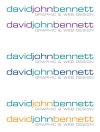
Eurostile... Naff or not?
- Thread starter djb
- Start date
DougBarned
Member
I like it. Although it very much depends on the application. I wouldn't want to see it associated with a wedding dress designer, but it would sit quite nicely for a builder for example.
/Doug
/Doug
Katedesign
Well-Known Member
Or a great chunk of text set in it - probably be a bit unreadable! But I like it too
DuncanGravill
New Member
I don't like it personaly, it doesn't excite me much. That doesn't mean it's a poor typeface though. It might work well for a corporate client that wants a modernist feel with a little edge. I like expression and most coporate clients aren't very expressive (say an acounting firm, they prefer logic to emotion) so they like things like this but I'm not too sure about it, although I quite like the rounded square form it has.
Site Engine
Member
I don't like it personaly, it doesn't excite me much. That doesn't mean it's a poor typeface though. It might work well for a corporate client that wants a modernist feel with a little edge. I like expression and most coporate clients aren't very expressive (say an acounting firm, they prefer logic to emotion) so they like things like this but I'm not too sure about it, although I quite like the rounded square form it has.
The company I provide consulting to the most uses it as their logo. Just their company name in Italic Red Eurostile.
I can't say I'm a massive fan.
However. Its better than Comic Sans.
- me
this_is_peter
Member
Not a big fan myself. But until this January EDF Energy used it as there corporate font. There are a big enough corporation. Not that I am saying they are a good judge.
I actually quite like it to be honest.
Like everything it just depends on whether it works for the purpose or not.
I finished my first freelance logo a few weeks back, which was Eurostile. It worked with what I was doing. Still a lot to learn - I may look back in a few years time and wonder what I was thinking!!
But it worked and the client was happy.
If the client is happy, I'm happy.
That's the main thing right? :icon_smile:
SparkCreative
Member
I like it too. Colour wise they all work - that's up to you.
Katedesign
Well-Known Member
I like also - eurostyle always seems for works best if all lowercase or all caps. Choose your favorite colourways and off you go.
NeedForBleed
Member
Your version of eurostile looks a bit squarer/squished, is that the standard version?
It's a clean looking font, I've just never taken to the squared areas of rounded letters, the lower case D and the O for example.
It's a clean looking font, I've just never taken to the squared areas of rounded letters, the lower case D and the O for example.
NeedForBleed
Member
BigDave has answered my silly question. Ignore me.
