You are using an out of date browser. It may not display this or other websites correctly.
You should upgrade or use an alternative browser.
You should upgrade or use an alternative browser.
Emma Nicholson Graphic Design
- Thread starter E_Nicholson
- Start date
JMGraphicDesign
Member
Hi Emma,
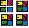
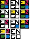
First of all I really like the strong colors chosen, they work well and I also like the typeface you've created for the large initials. The only thing I might try to adjust is the smaller text around the outside, as it has the feeling of something added as an after thought, when ideally all the elements should merge together seamlessly as integral parts of the design. Perhaps the wording outside can be made to interact with the rest of the logo in a larger way? A very nice job though, that's the only constructive criticism that comes to my mind! (Maybe you could create a gap between all the letter boxes and have the small text criss-cross through the center? I dissected it a little from a screen shot just to show you my idea - I hope you don't mind!)
The only reason I'm suggesting integrating the small type into the framework of the logo at all is because to my eye it throws the otherwise pleasing symmetry of the logo off a little - this is just my opinion of course
First of all I really like the strong colors chosen, they work well and I also like the typeface you've created for the large initials. The only thing I might try to adjust is the smaller text around the outside, as it has the feeling of something added as an after thought, when ideally all the elements should merge together seamlessly as integral parts of the design. Perhaps the wording outside can be made to interact with the rest of the logo in a larger way? A very nice job though, that's the only constructive criticism that comes to my mind! (Maybe you could create a gap between all the letter boxes and have the small text criss-cross through the center? I dissected it a little from a screen shot just to show you my idea - I hope you don't mind!)

The only reason I'm suggesting integrating the small type into the framework of the logo at all is because to my eye it throws the otherwise pleasing symmetry of the logo off a little - this is just my opinion of course
E_Nicholson
New Member

Thanks for the reply it was very helpful! I loved your idea and did something quite similar on number 2, i like them all though to be honest and yes I see where you are coming from where the texts makes it look unbalanced. And no I don't mind at all I love it when people show me their perspective on things.
Would you like to see some of my other work? Flickr: E_Nicholson's Photostream
Thanks again this really helped
Tony Hardy
Well-Known Member
Hi Emma,
Have you thought about just playing with the negative space the shapes create. Would it still be legible then? Would it form a nice logo-mark that you can back up with some text?
I don't know why but for some reason what you have now is reminding me of the board game, Ludo.
Tony
Have you thought about just playing with the negative space the shapes create. Would it still be legible then? Would it form a nice logo-mark that you can back up with some text?
I don't know why but for some reason what you have now is reminding me of the board game, Ludo.
Tony
E_Nicholson
New Member
Tony Hardy
Well-Known Member
Hey Emma,
I meant doing away with the black lettering altogether and just trying to use the coloured negative spaces?
I meant doing away with the black lettering altogether and just trying to use the coloured negative spaces?
JMGraphicDesign
Member
I think the top left and bottom left versions get my vote 
Now the whole logo looks nicely balanced and the smaller text flows rather than distracts.. good job I'd say!
Now the whole logo looks nicely balanced and the smaller text flows rather than distracts.. good job I'd say!
MJ96
Member
Hi Emma
Personally I don't think think the font used for your name sits nicely beside your initials, its a little small in comparison so doesn't scale down well. As Tony has said, maybe you could have a play with the initials, and make a kind of abstract logo-mark that could sit above your name, then you can incorporate the colours into that, only when happy with the icon.
Hope this helps!
LovesPrint
Member
The smaller text will be illegible on things like business cards.

