Inkling
New Member
Hello. I'm looking for some feedback on a project I've done for school. It's the redesign for some egg nog packaging (I'm originally from Canada, and egg nog is a very popular Christmas drink there).
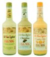
This is the original packaging.
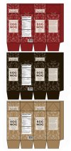
I repackaged it so that it's in cartons which is the most common way to package eggnog. I did this because egg nog can actually look quite off putting and having it in a clear bottle just shows off the gross aspect of the product. I used some hand drawn elements in the packaging (the pattern) because the key word for my project was "handmade".

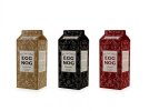
Here is a final mockup.
I would really appreciate a critique. Feel free to be brutally honest. Thanks.
This is the original packaging.

I repackaged it so that it's in cartons which is the most common way to package eggnog. I did this because egg nog can actually look quite off putting and having it in a clear bottle just shows off the gross aspect of the product. I used some hand drawn elements in the packaging (the pattern) because the key word for my project was "handmade".


Here is a final mockup.

I would really appreciate a critique. Feel free to be brutally honest. Thanks.