mhossey
New Member
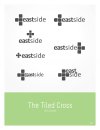
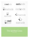
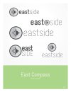
Hello friends, first time posting in design forums for critique. Let me have the raw emotions and criticism you have. This is for a Baptist Church who is re-branding and looking to drop the "Baptist Church" - hence just "East Side"
The concept behind these 3 ideas is to be friendly, Inviting, and a touch of corporate. The pastor does like a little bit of artsy-ness, but at the same time wants to keep it clean.
All ideas are B&W until we decide on a direction, each concept has left itself open for the use of 3-4 colors; the church made it very clear they do not want to be bound by a certain color, so this leaves the option to do a nice color scheme.
Would love to hear from some other seasoned designers out there")
Michael
The concept behind these 3 ideas is to be friendly, Inviting, and a touch of corporate. The pastor does like a little bit of artsy-ness, but at the same time wants to keep it clean.
All ideas are B&W until we decide on a direction, each concept has left itself open for the use of 3-4 colors; the church made it very clear they do not want to be bound by a certain color, so this leaves the option to do a nice color scheme.
Would love to hear from some other seasoned designers out there
Michael